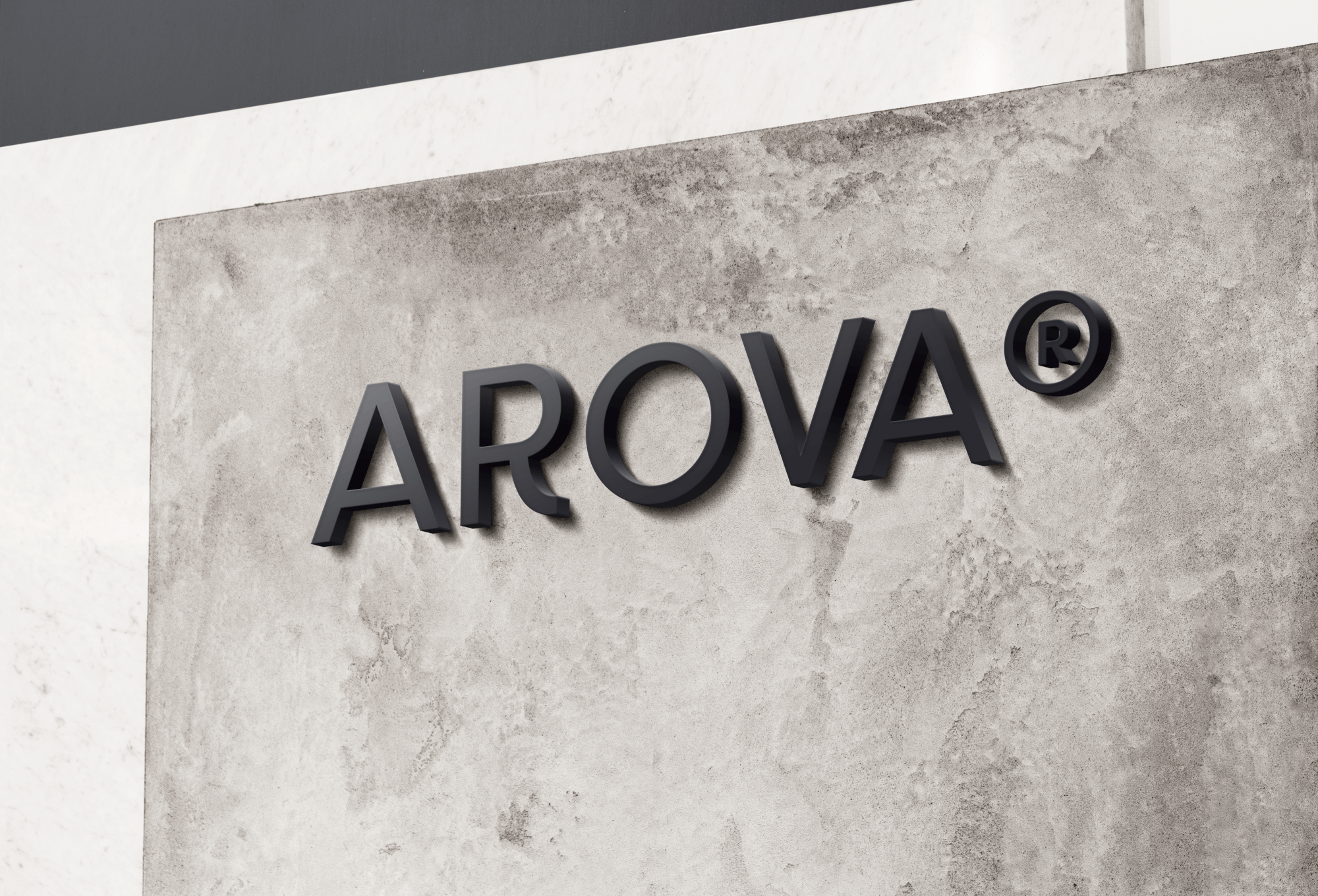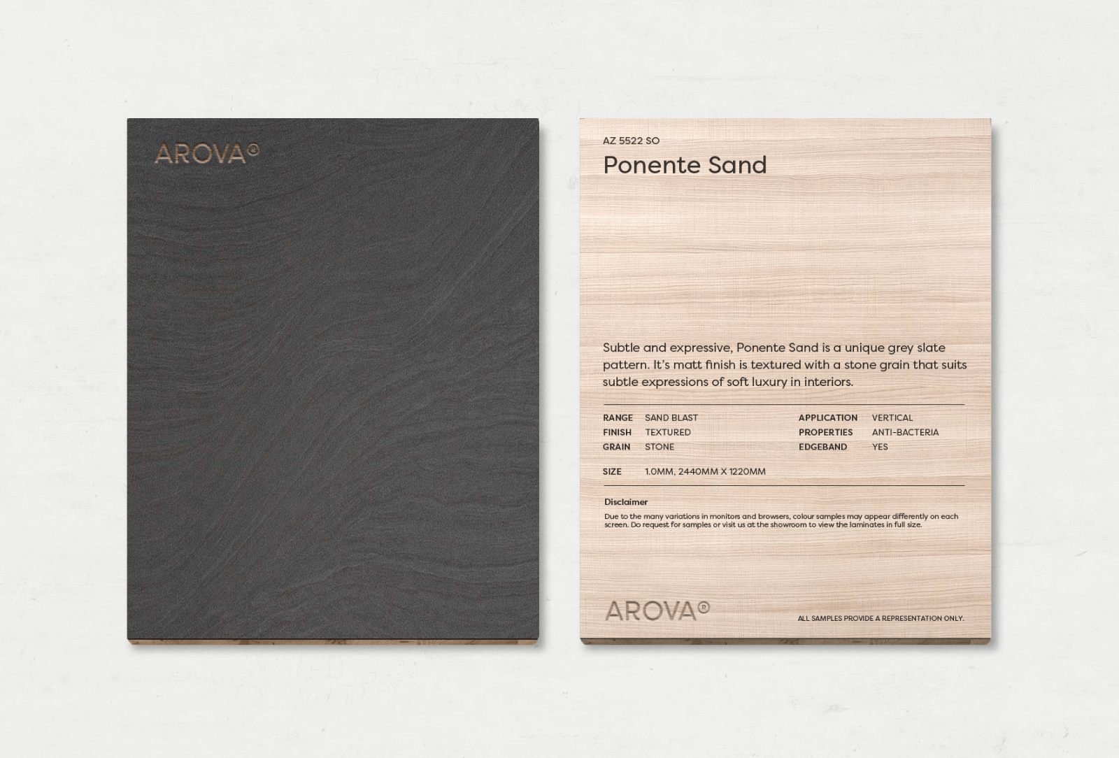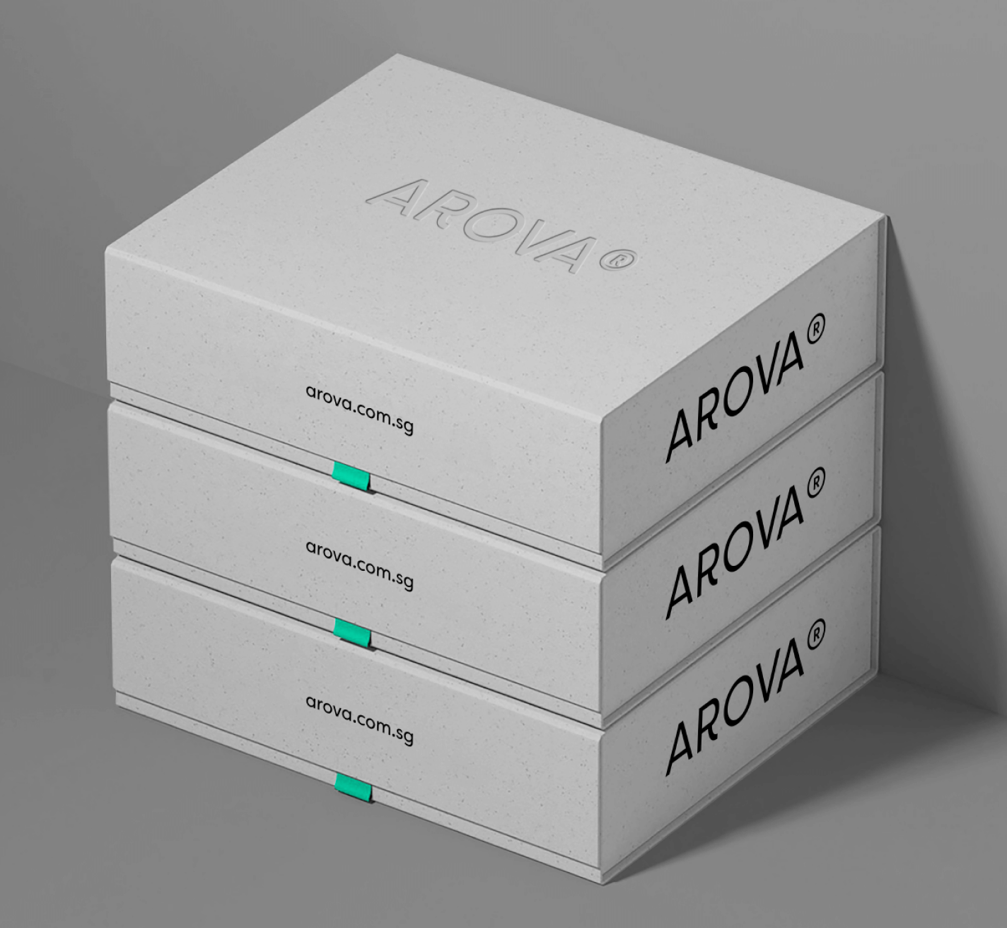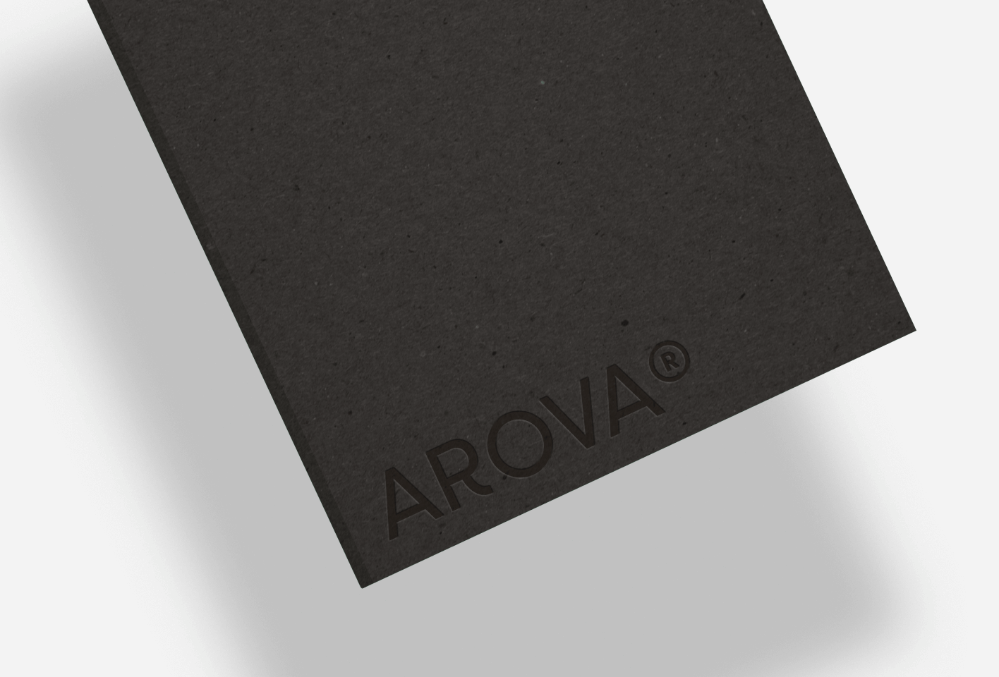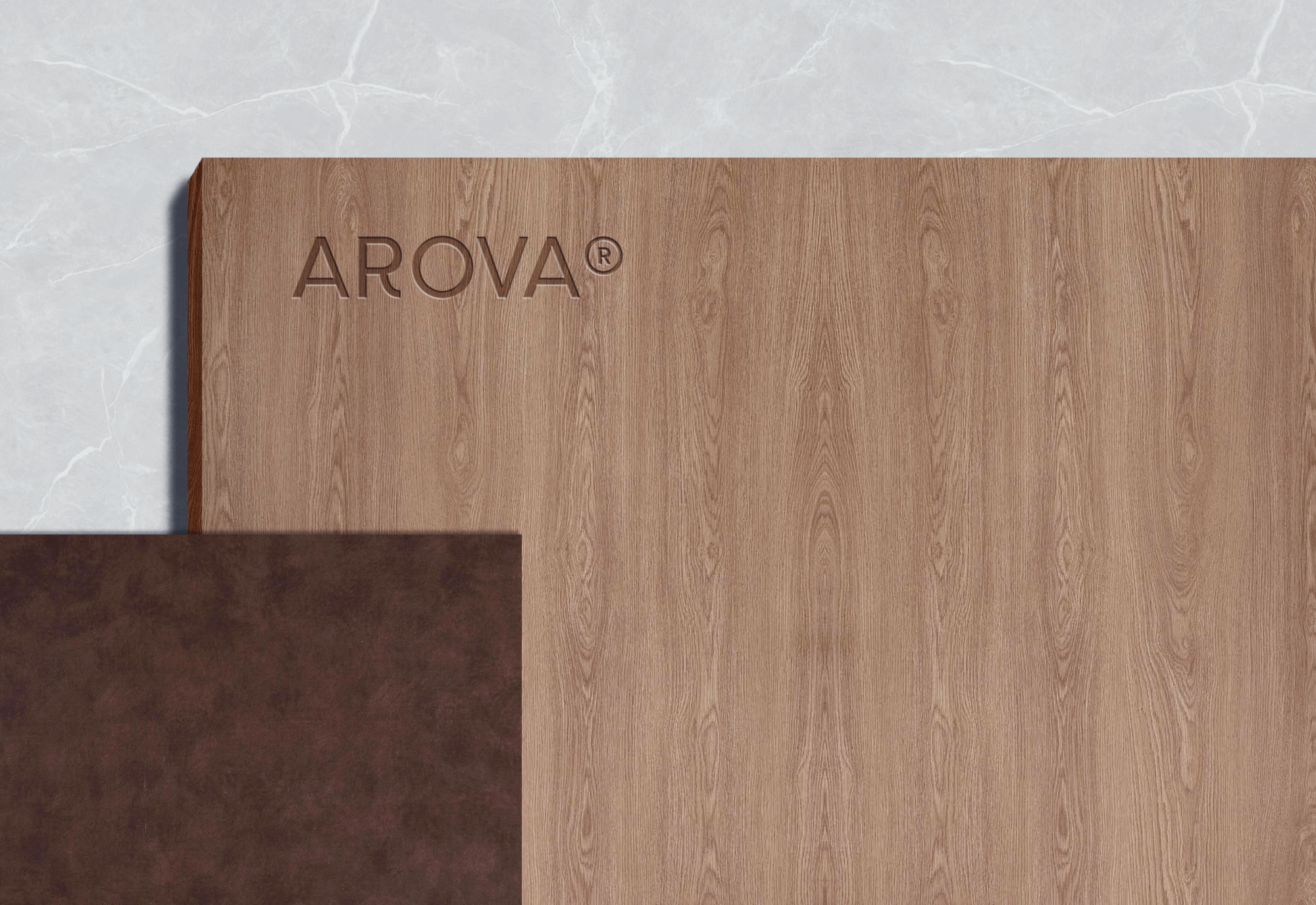
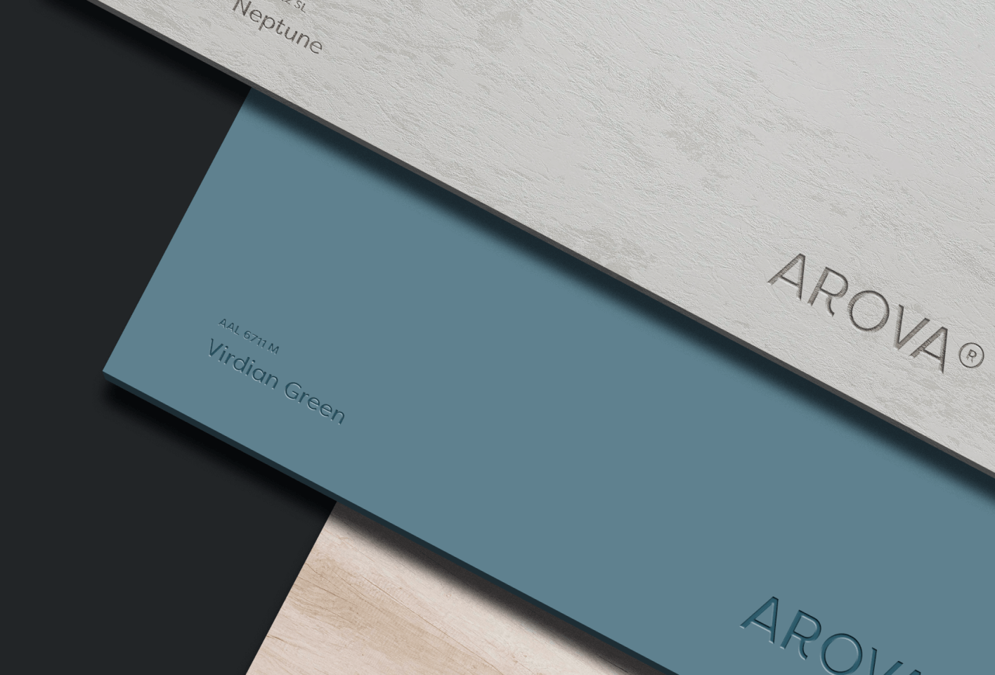

Debossed logo on laminate samples
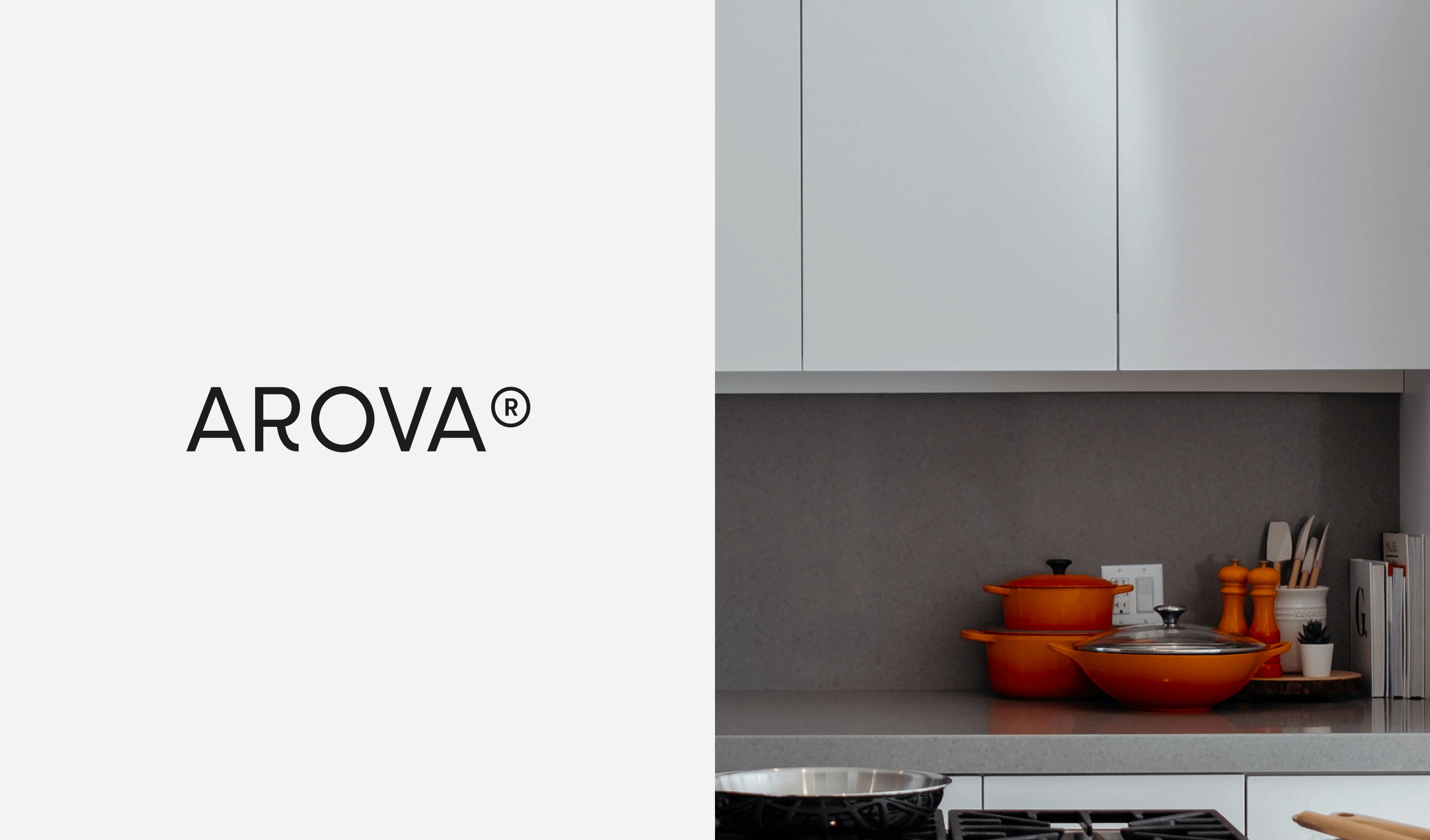
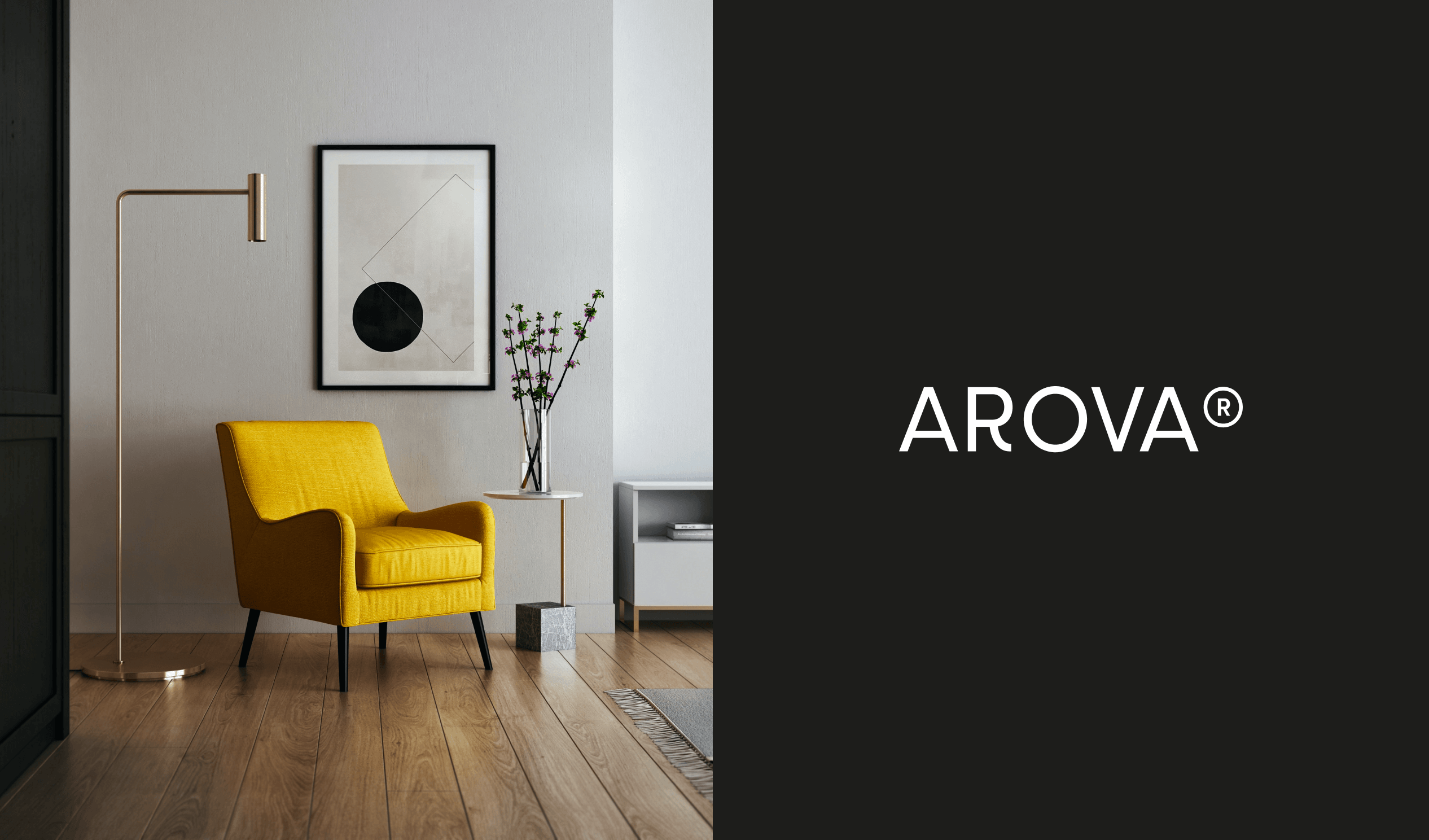
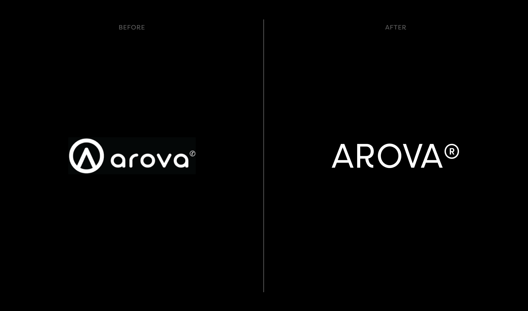
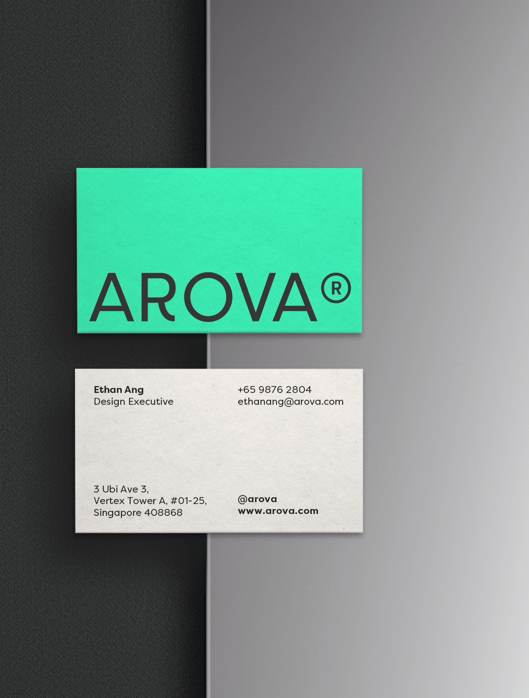
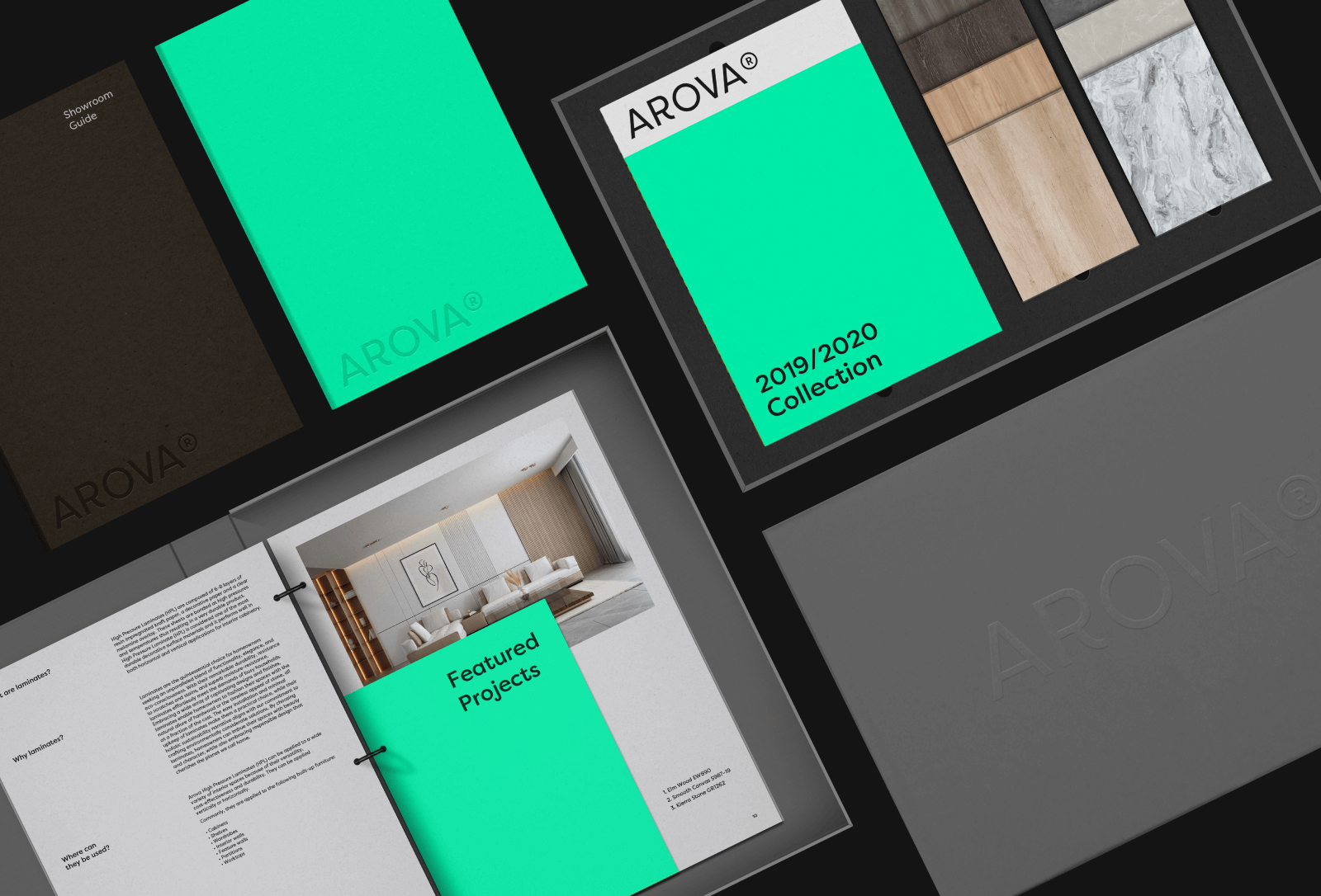
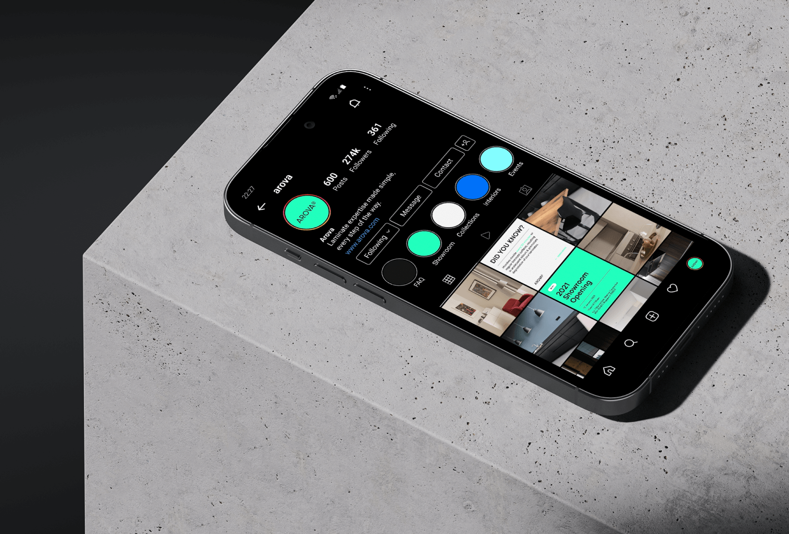
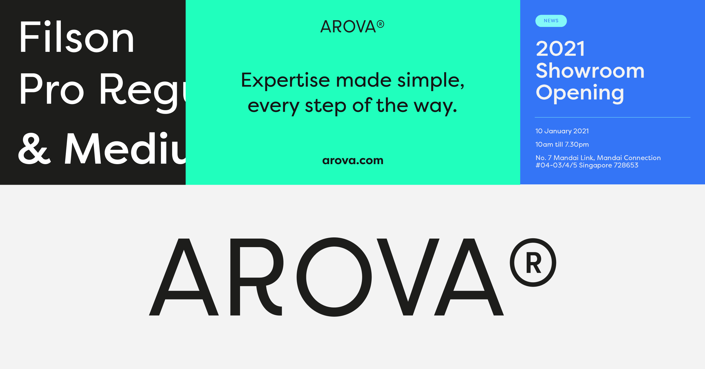
Arova
2019
BRAND
Digital
print
Client
Arova
Agency
Bravo
Role
Lead Designer
Industry
Lifestyle, Industrials, Retail
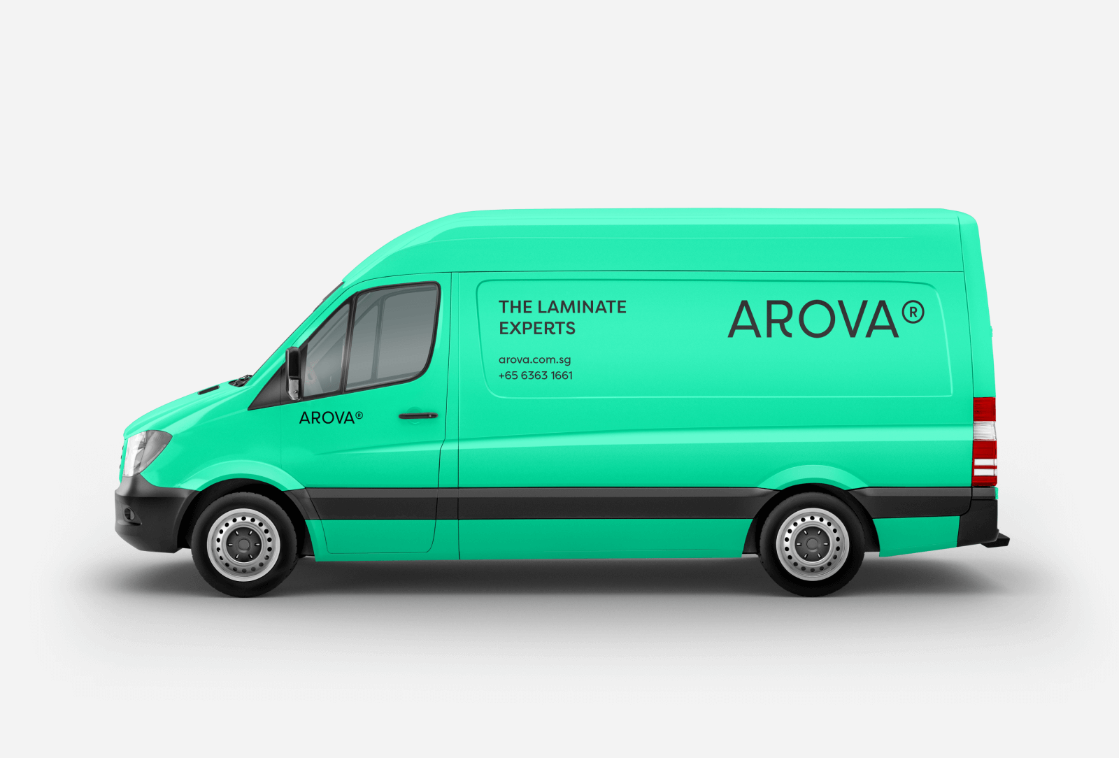
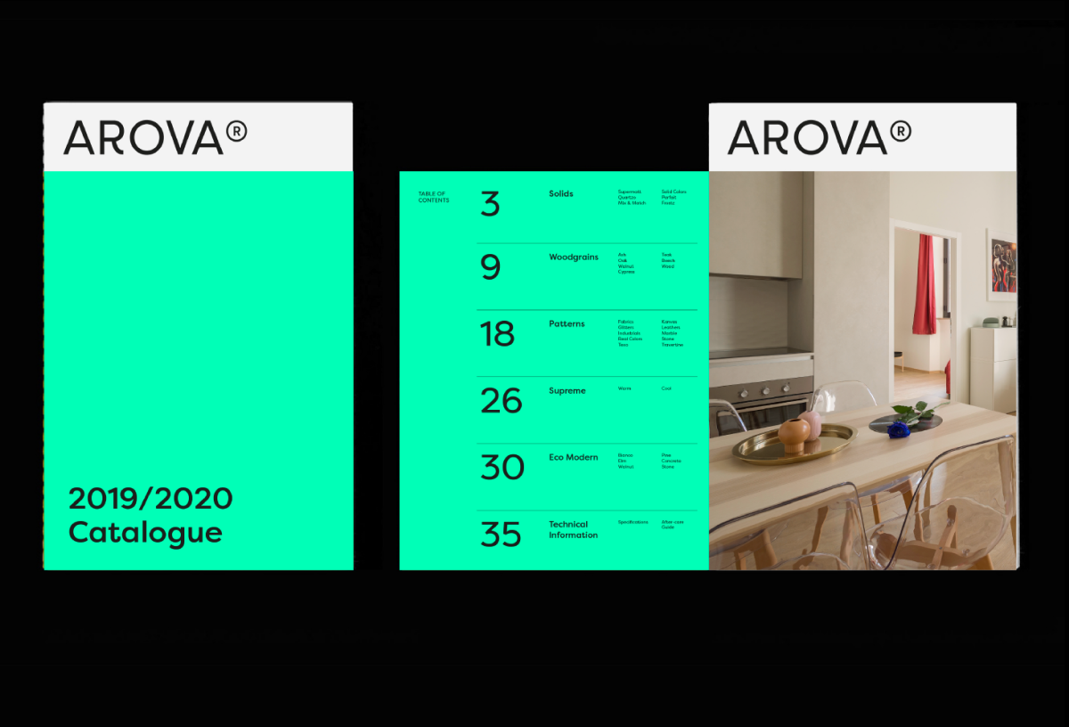
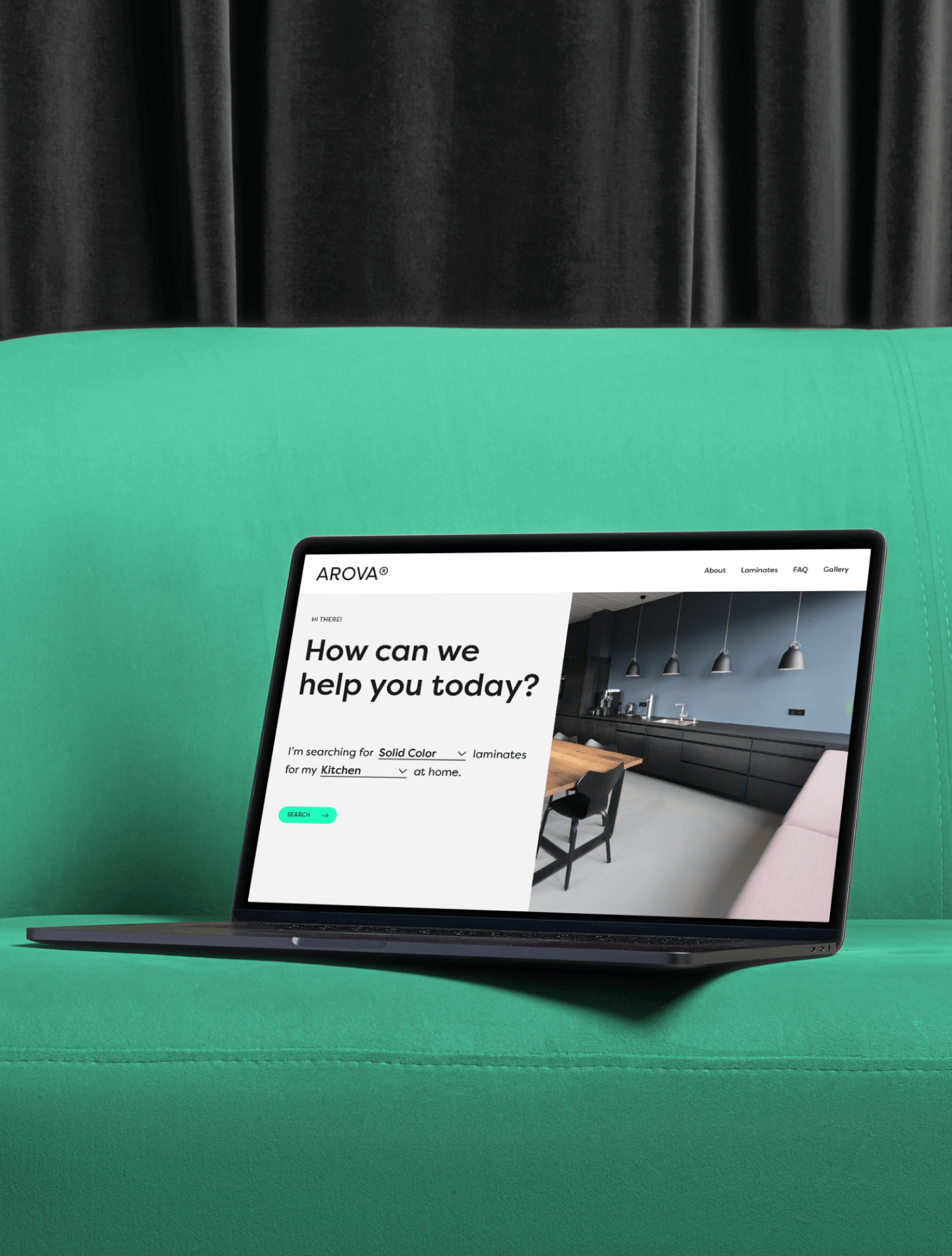
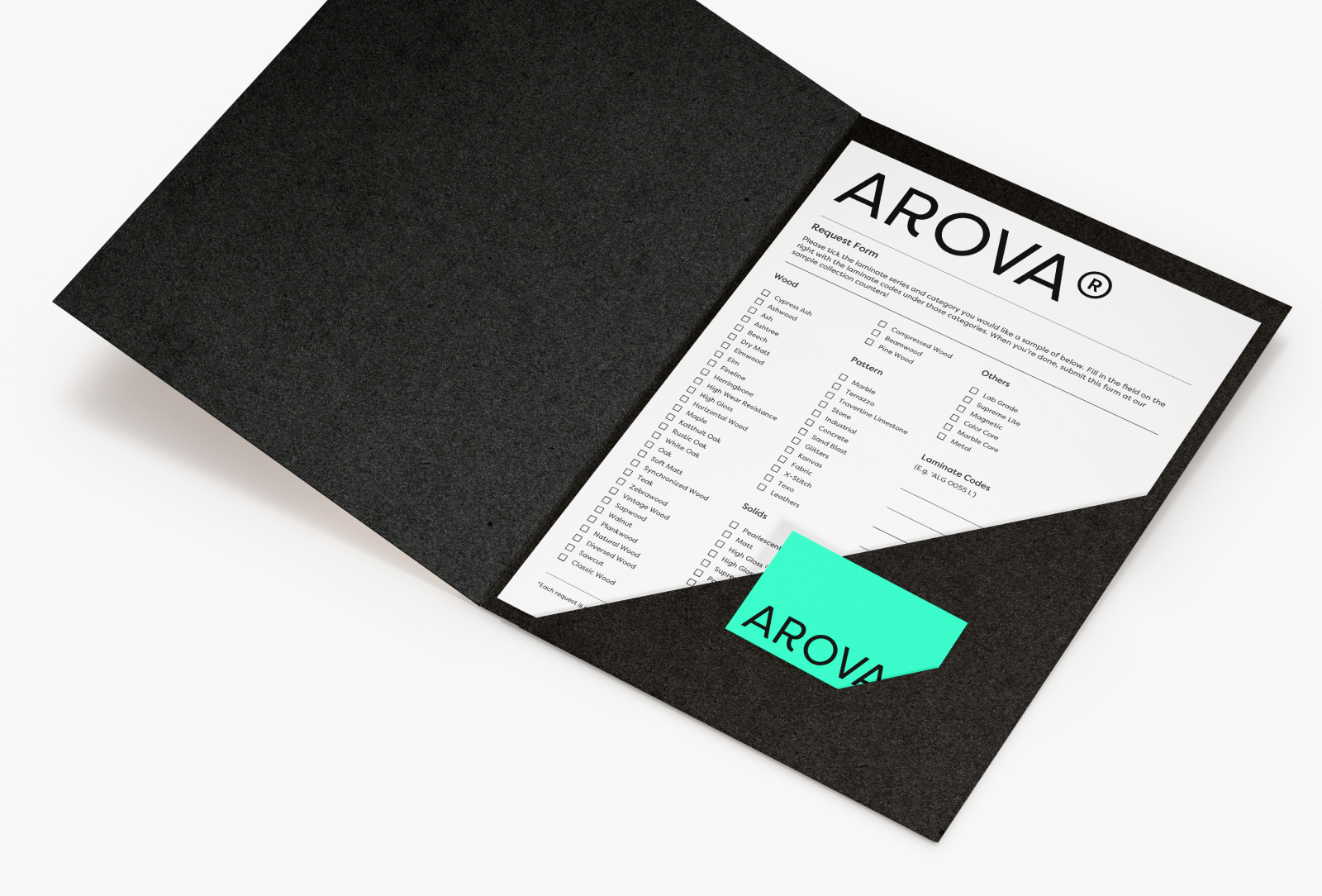
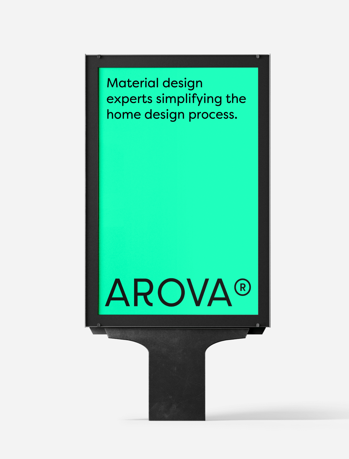
Arova is an innovative, high pressure laminate brand with a commitment to superior quality, eco-conscious design. A laminate brand catering to not just the creative professionals designing spaces, but especially for the homeowners building their home. We refreshed Arova’s identity & brand strategy, re-centering the brand for a new generation of modern homeowners.