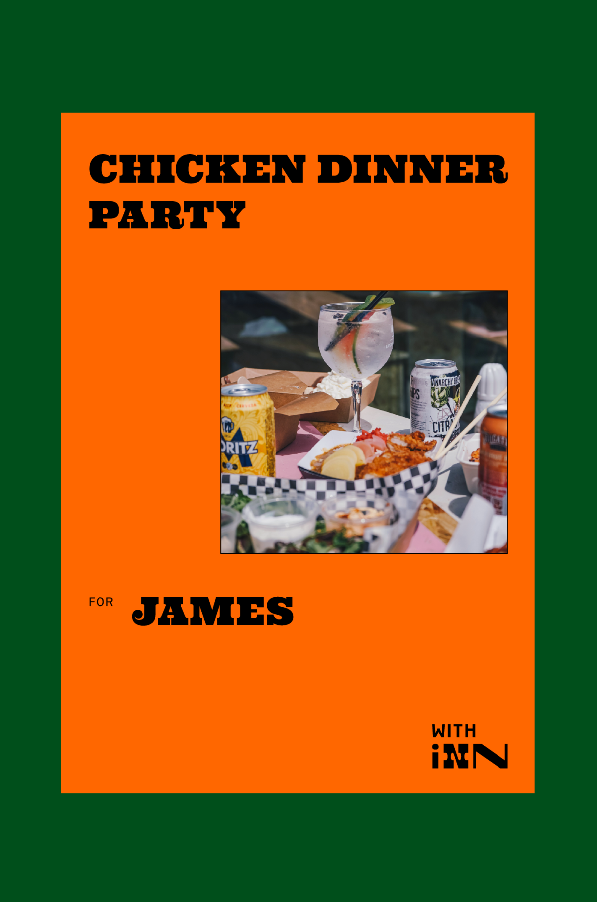
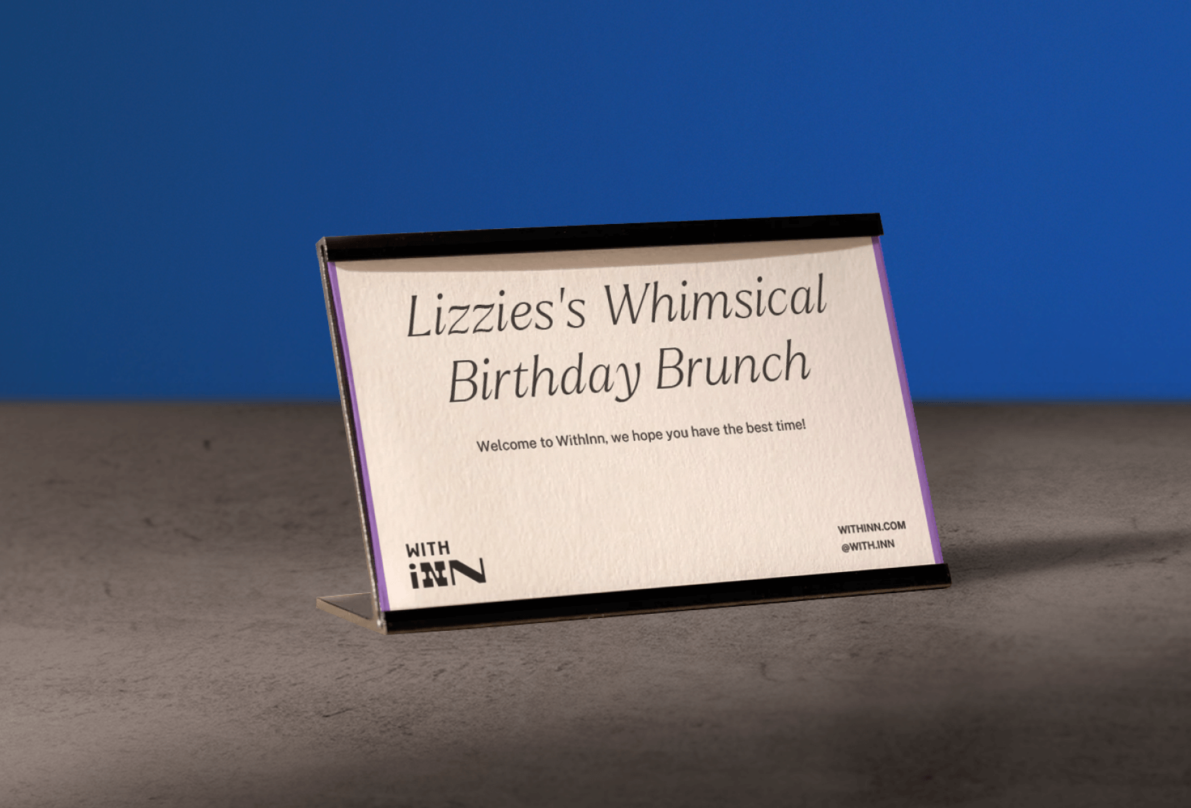
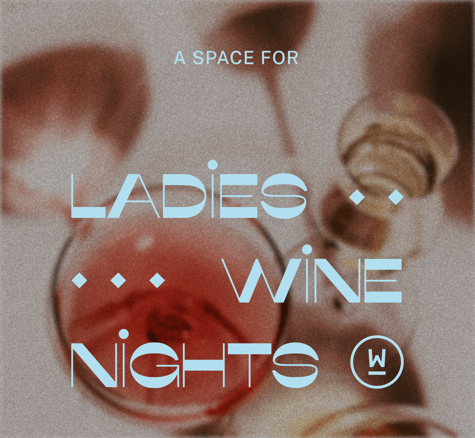
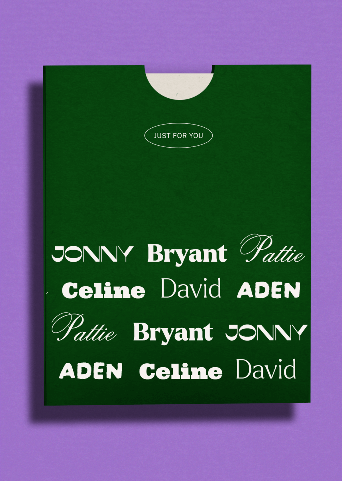
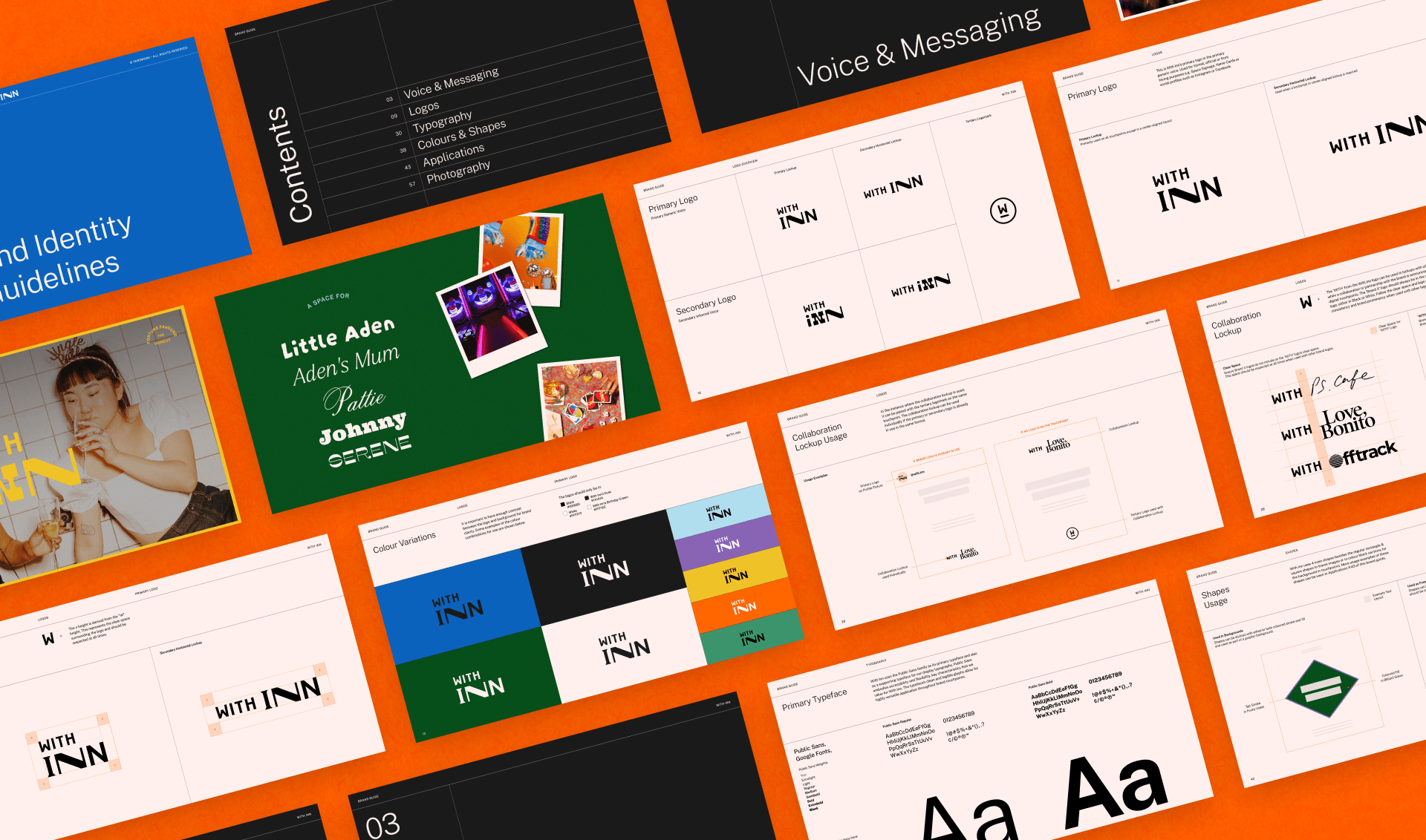
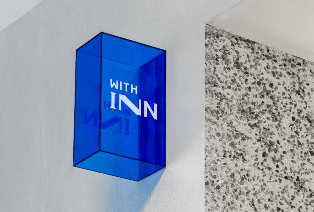
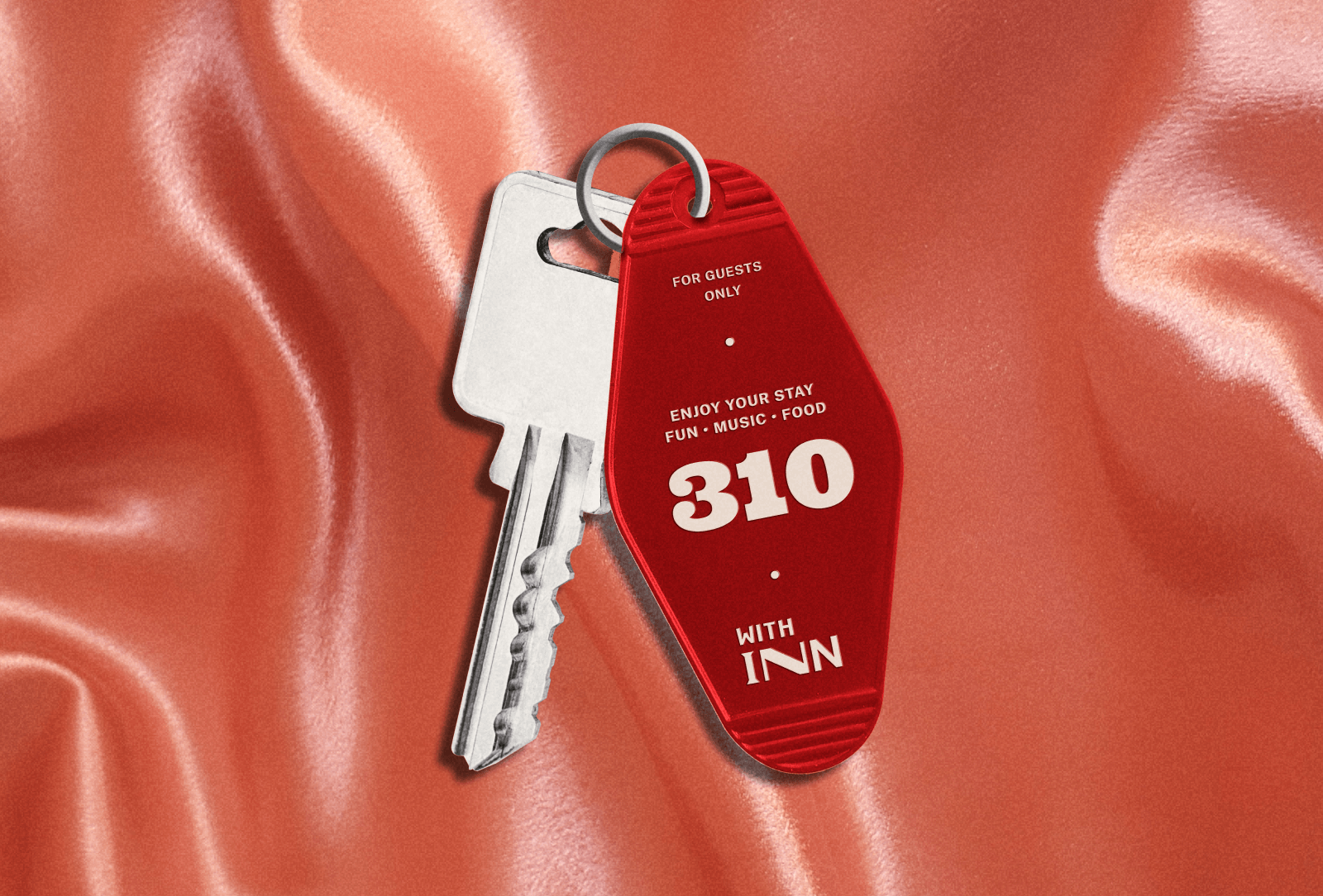
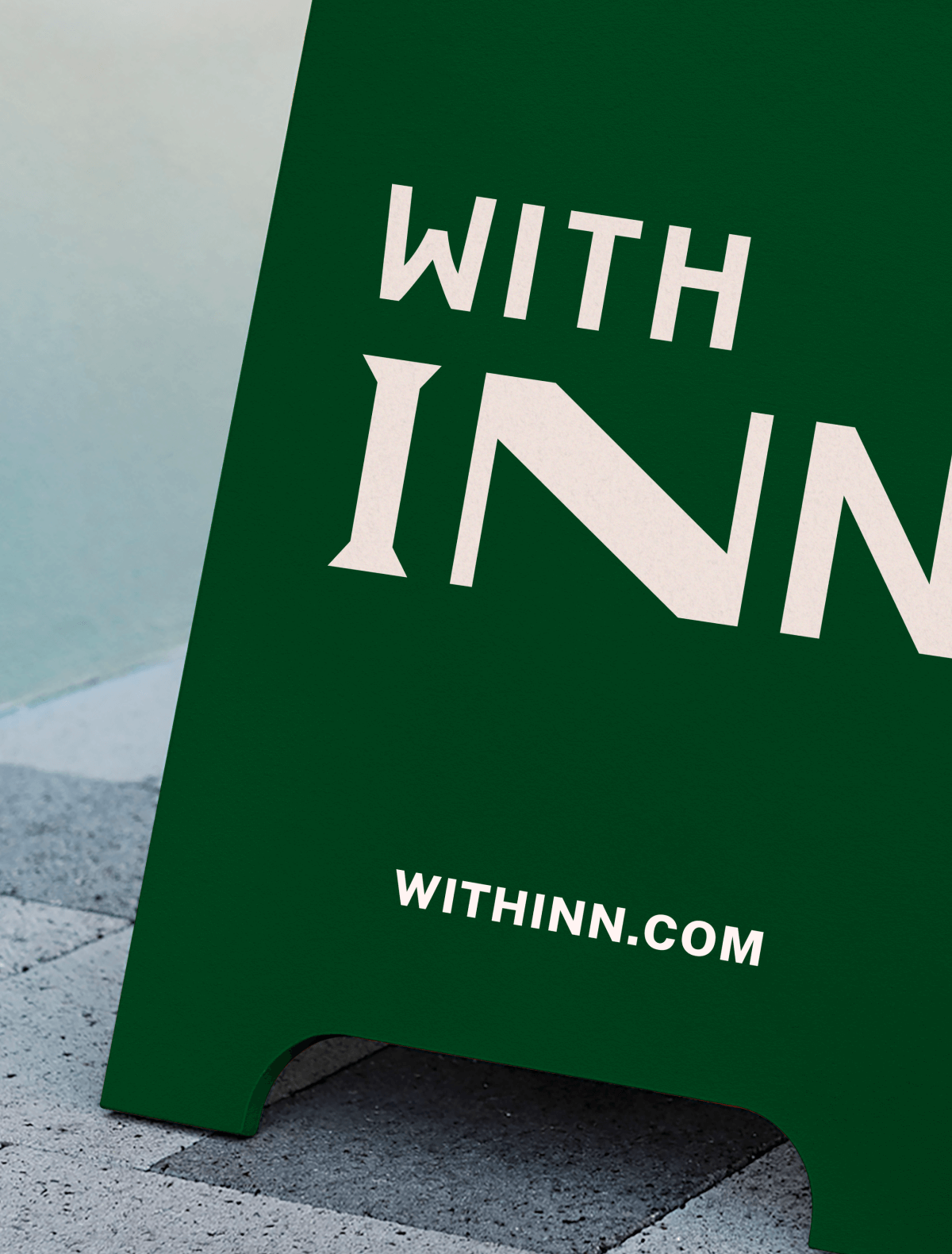
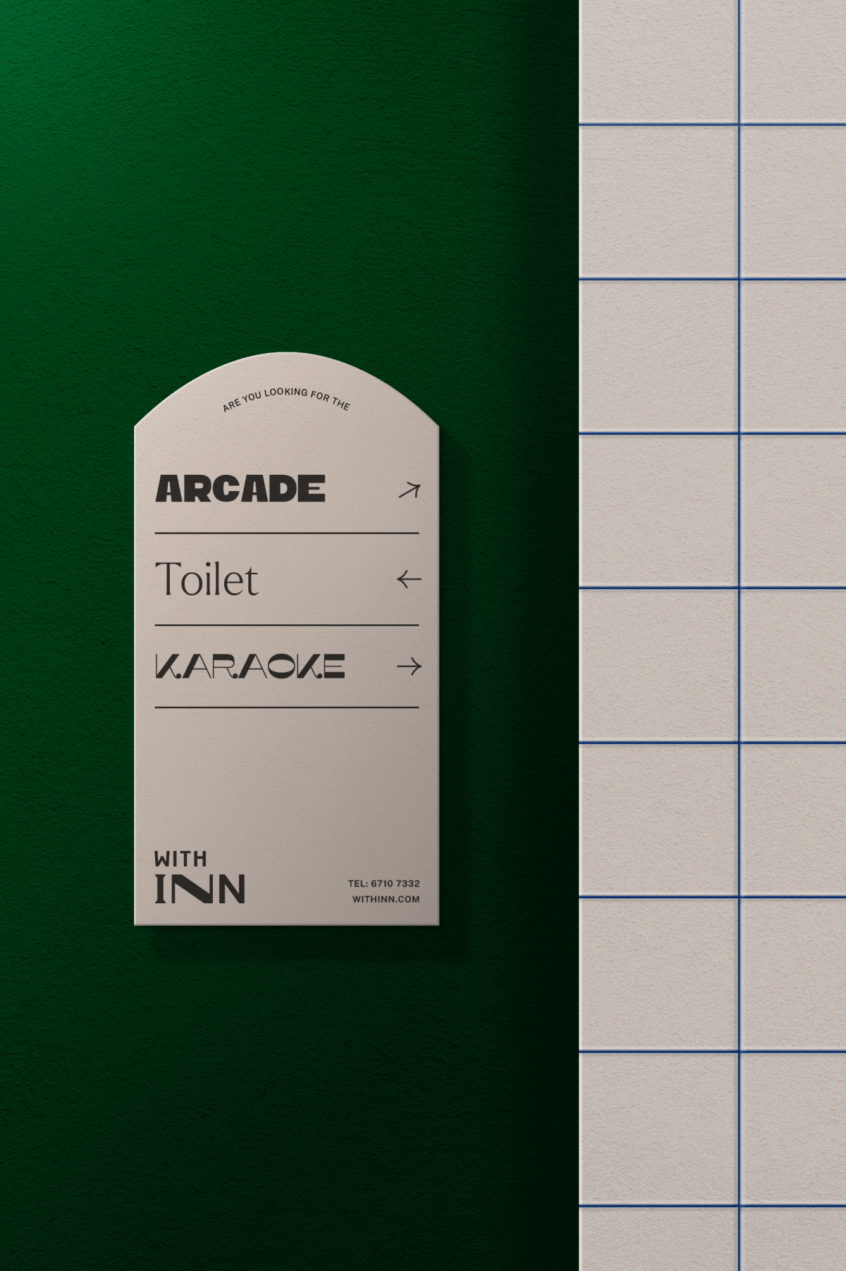
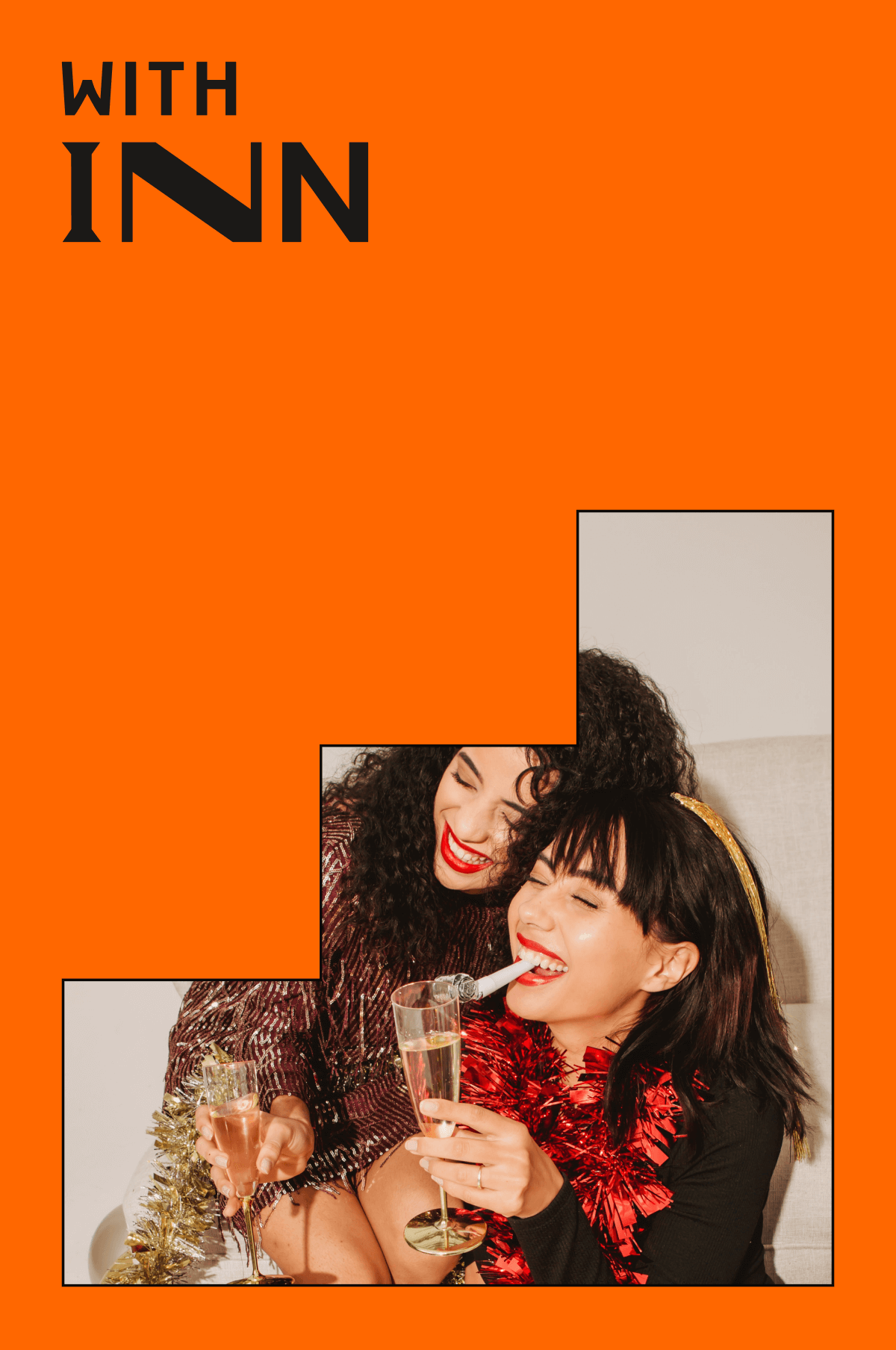
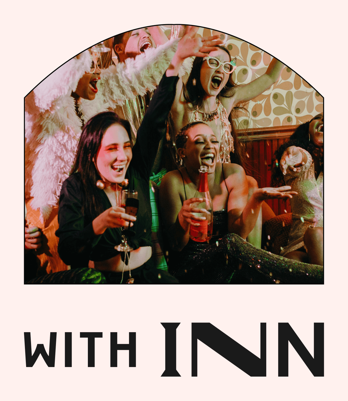
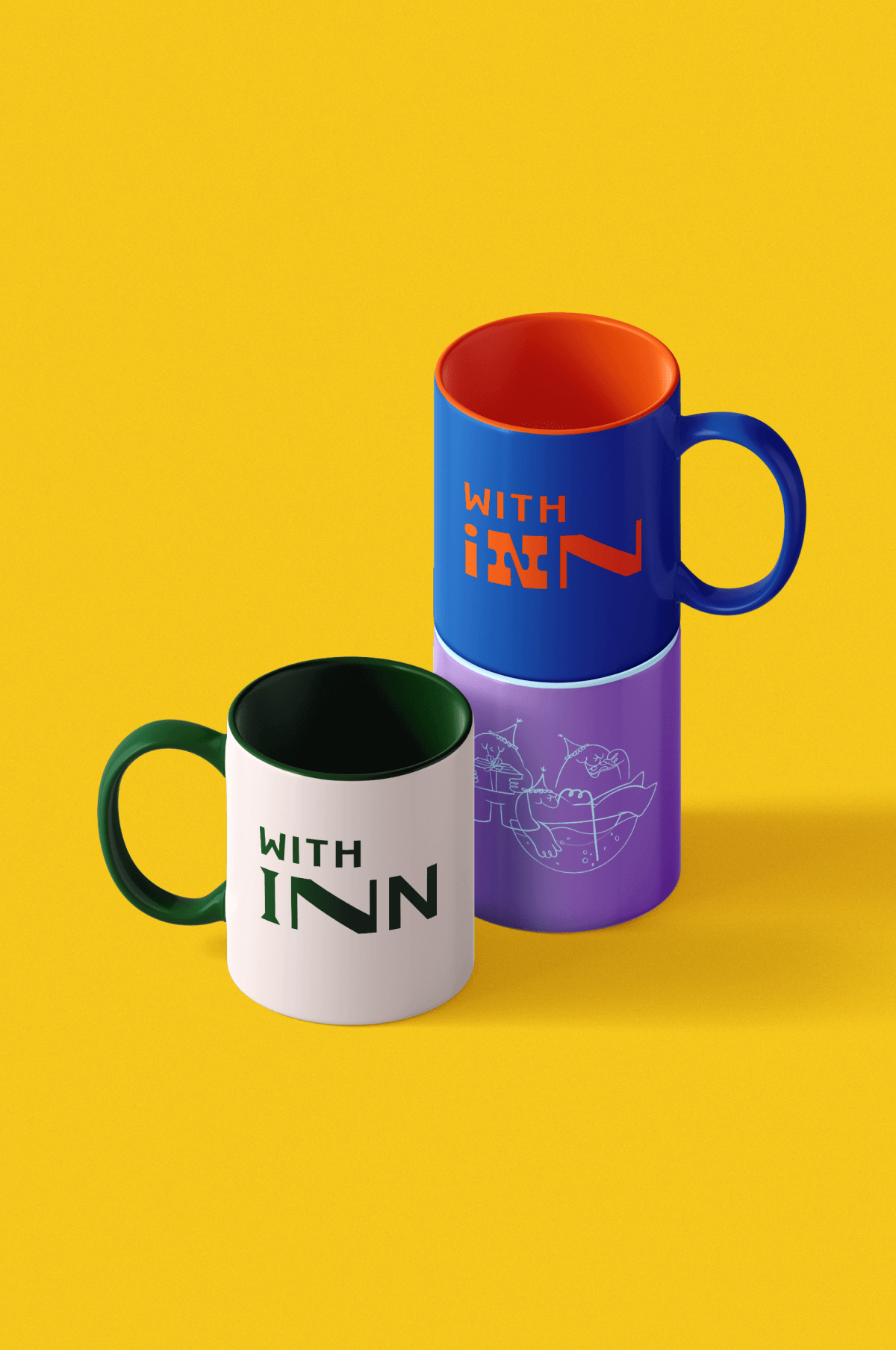
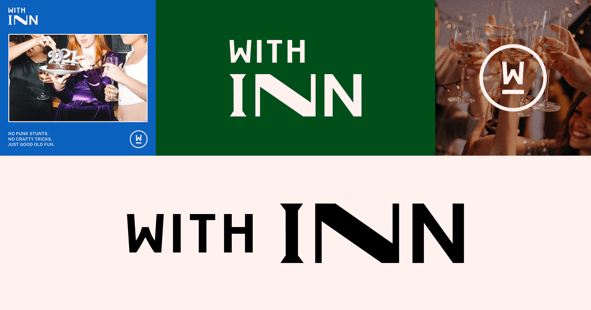
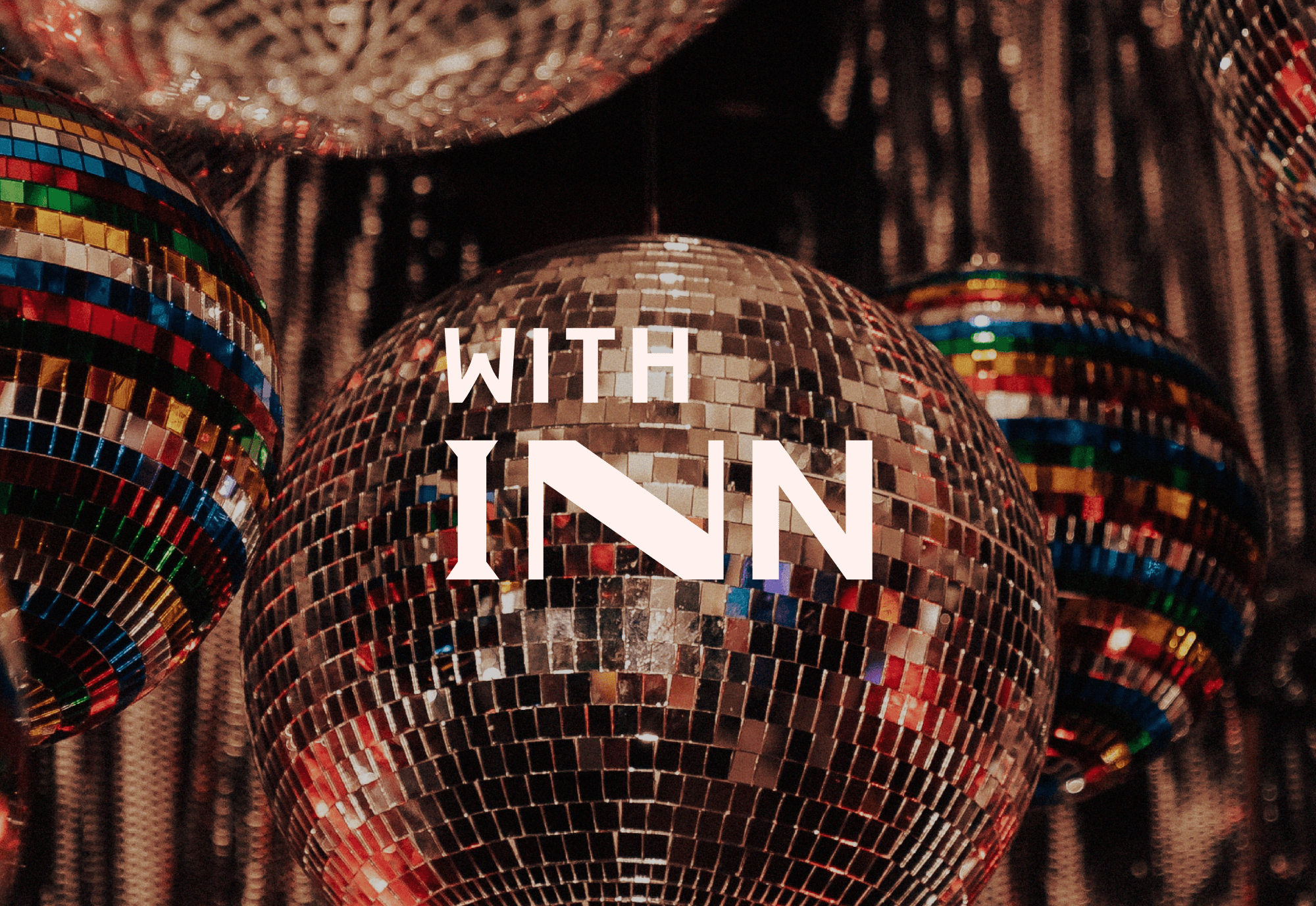
Withinn Wayfinding signage
Wayfinding signage

With Inn

2023
BRAND
Digital
print
Client
With Inn
Agency
Yardwork
Role
Designer & Art Director
Industry
Lifestyle, Entertainment, Events

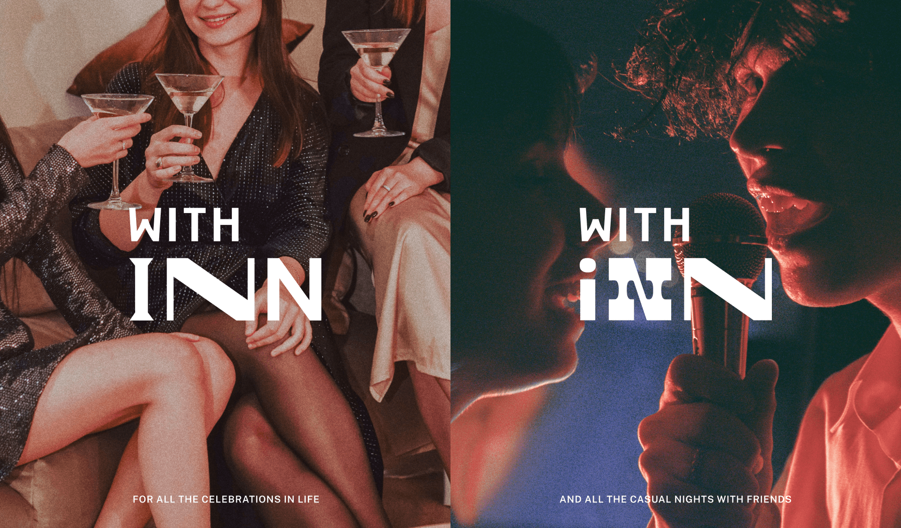
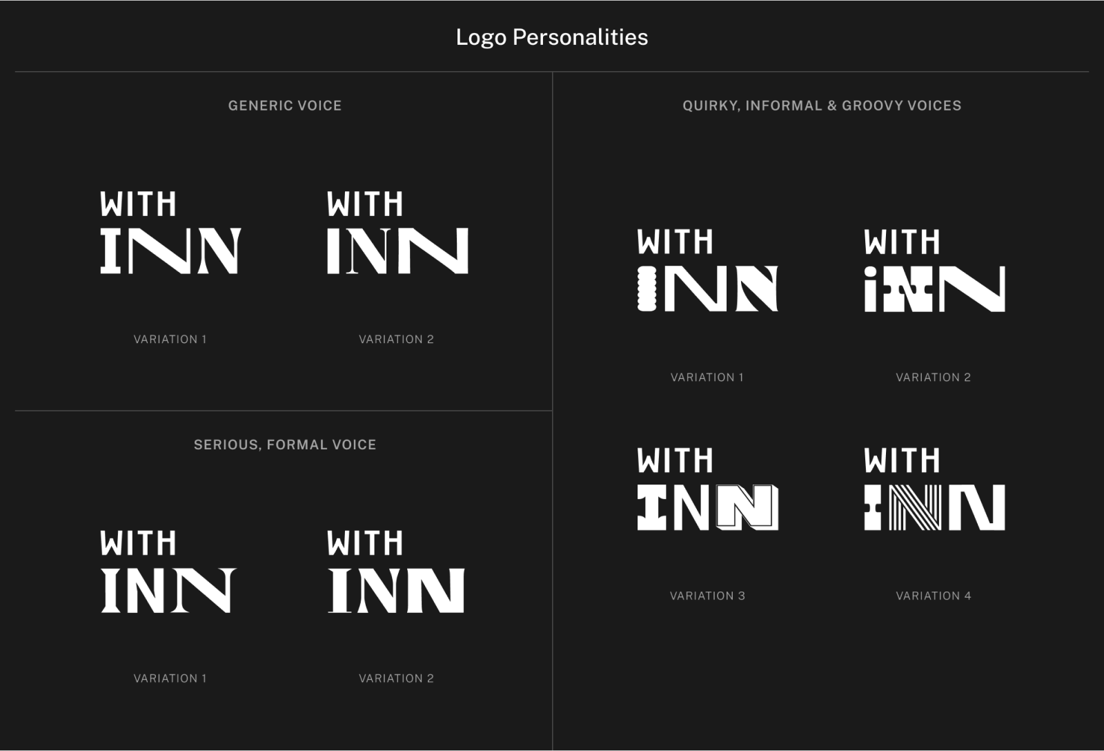
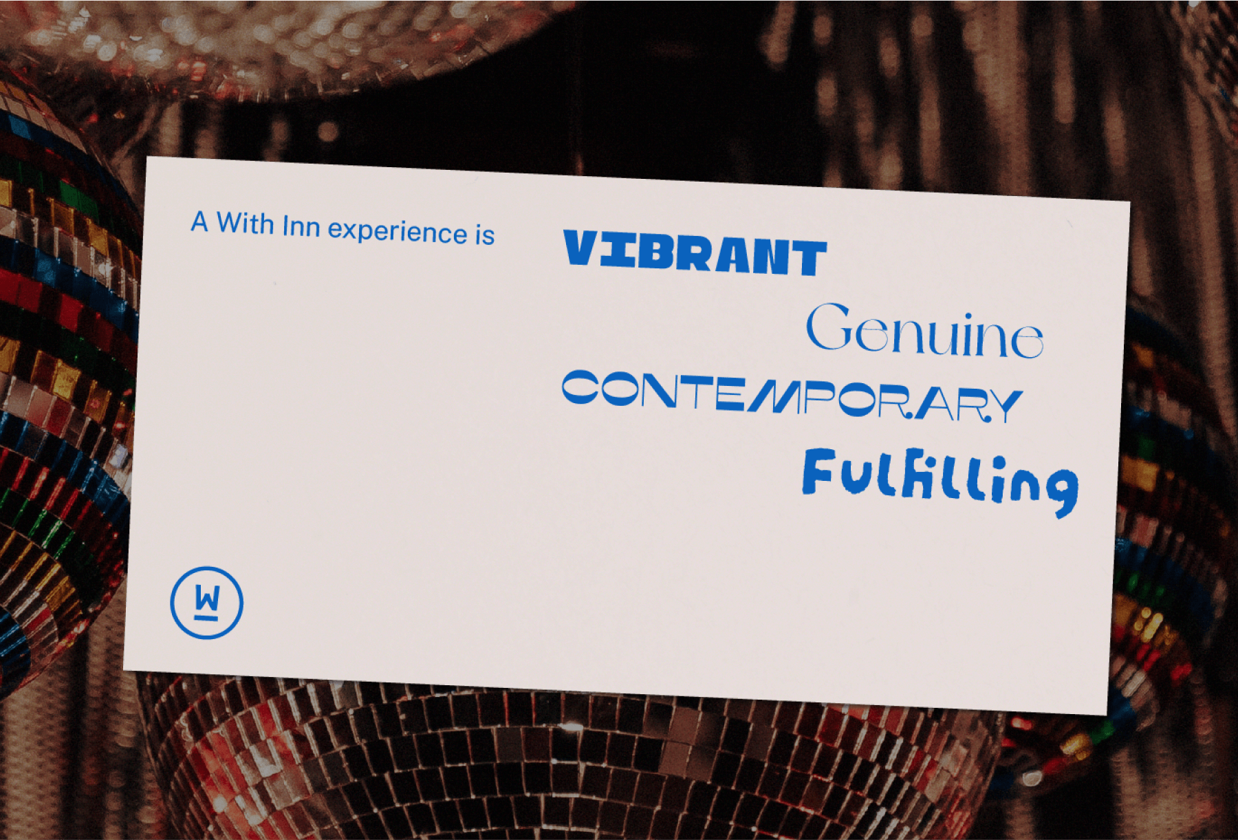
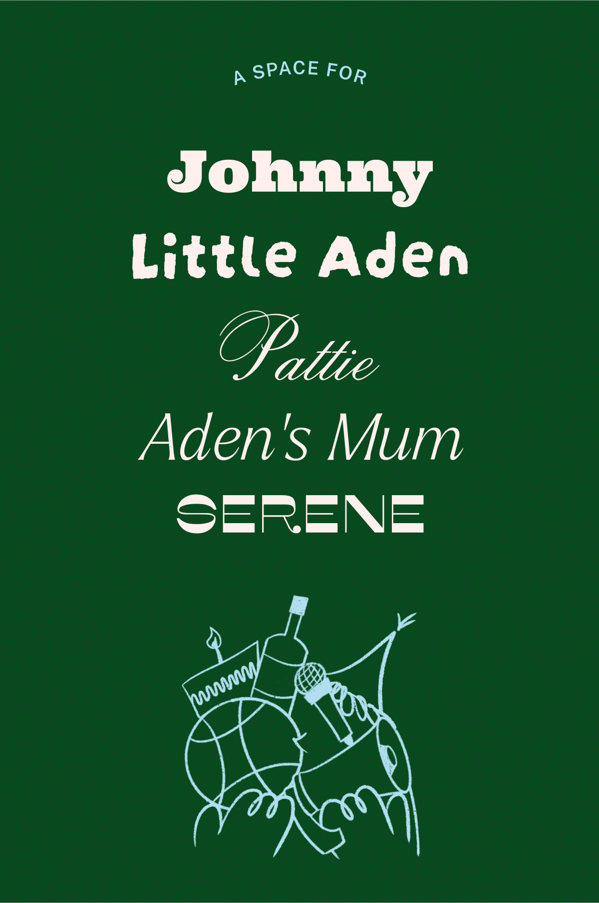
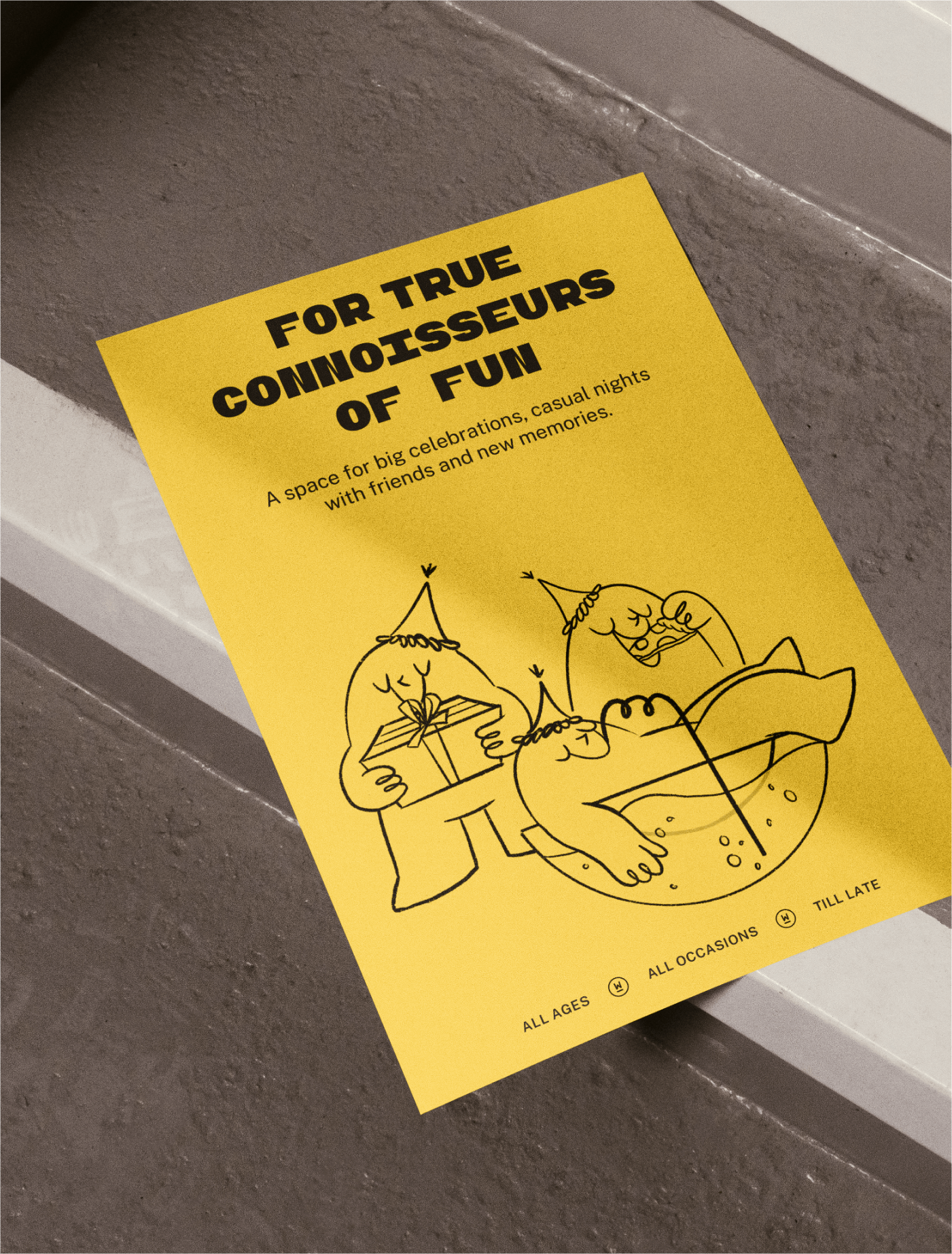
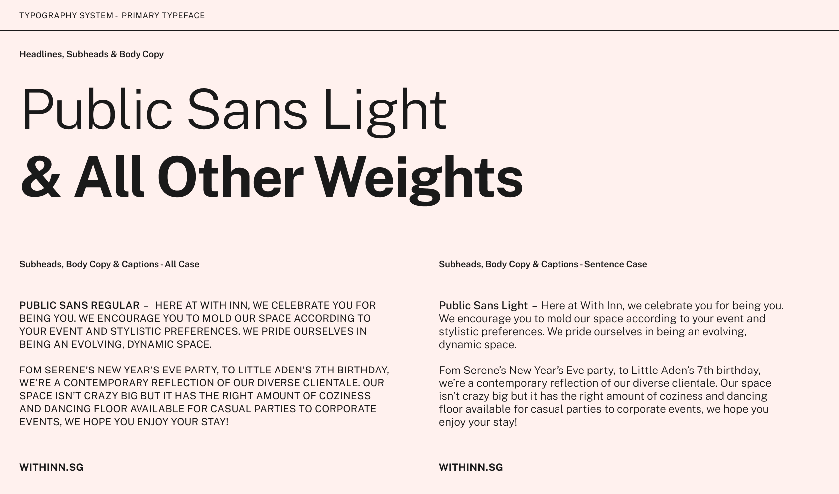
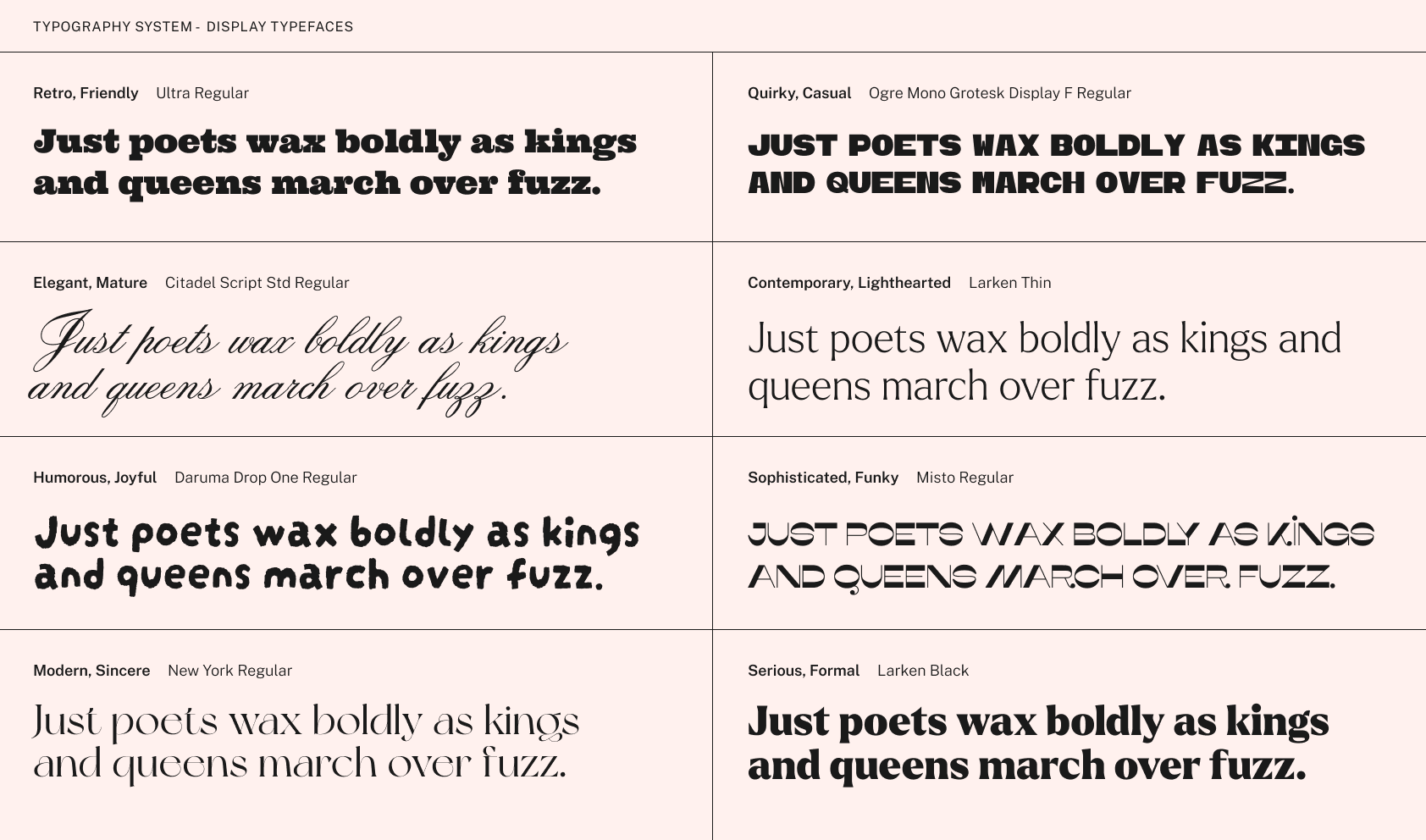
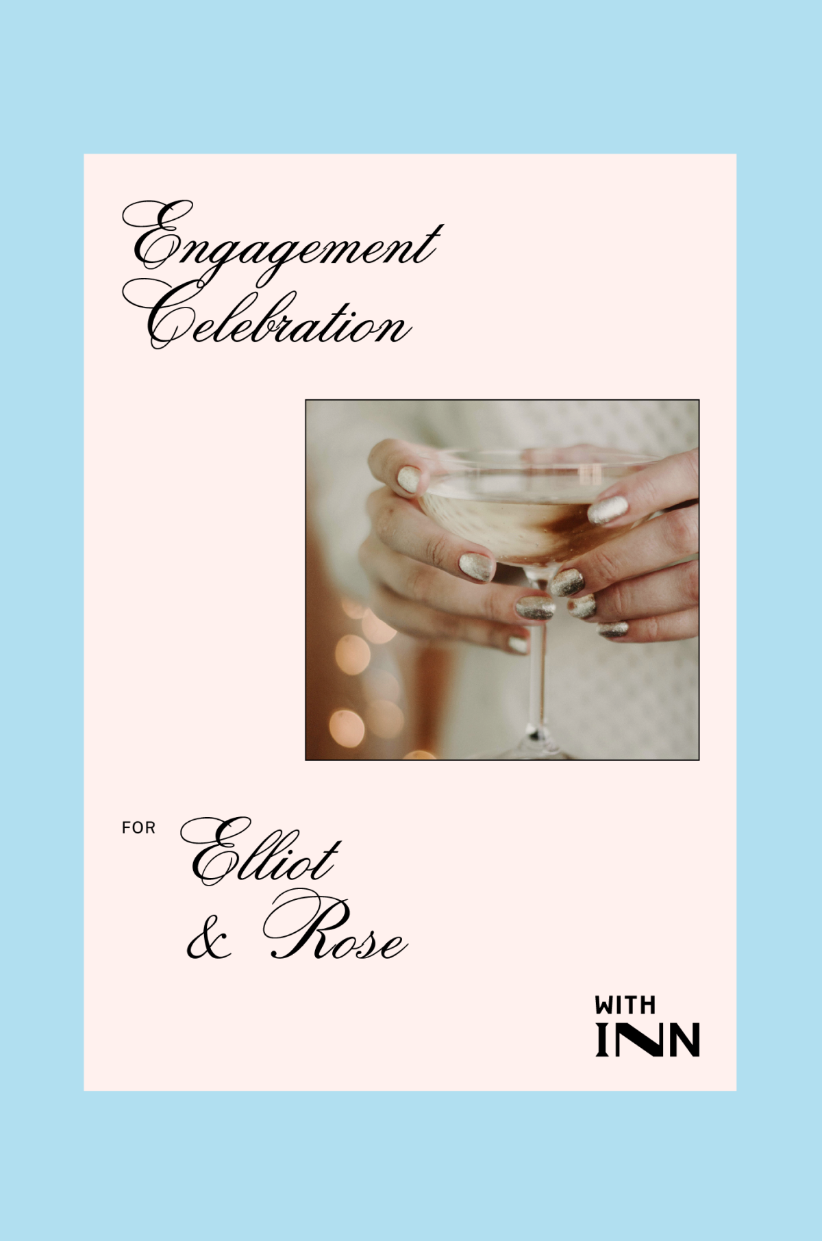
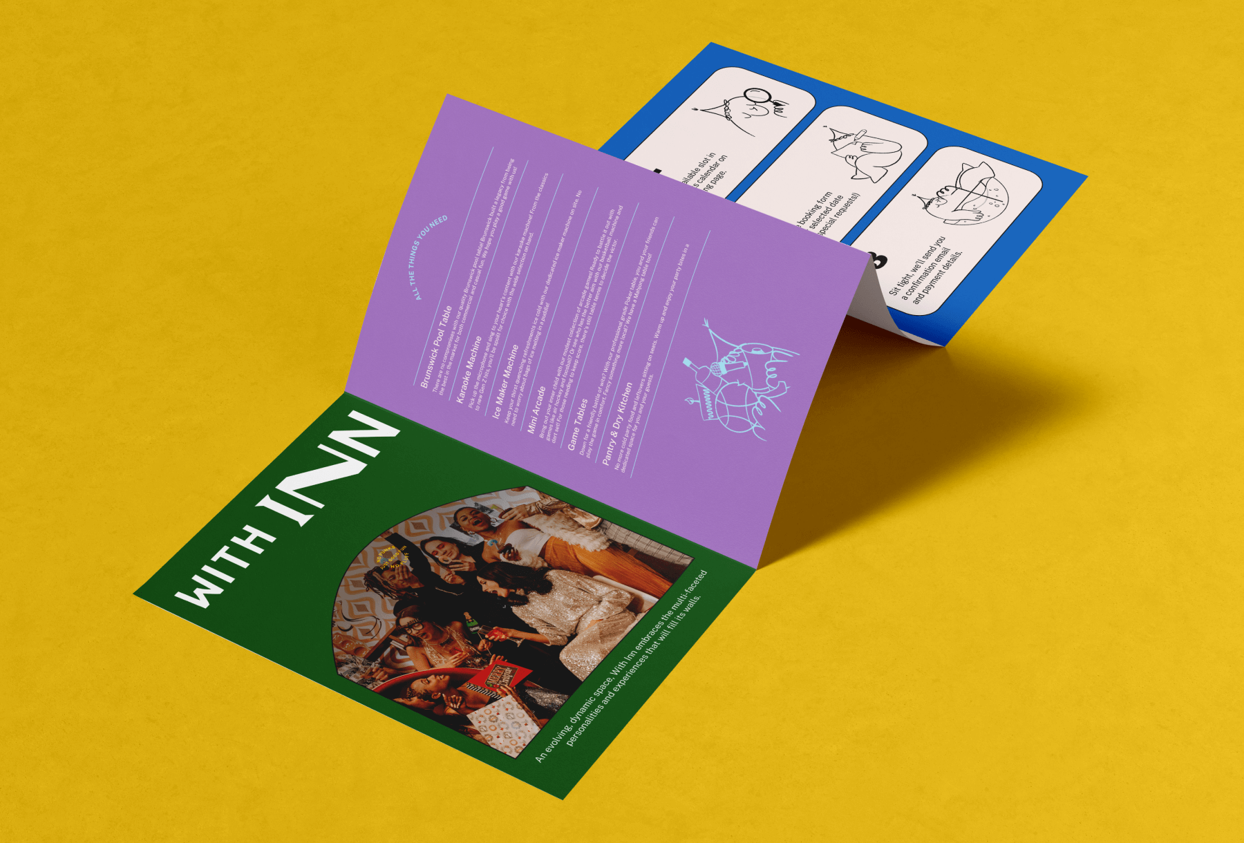
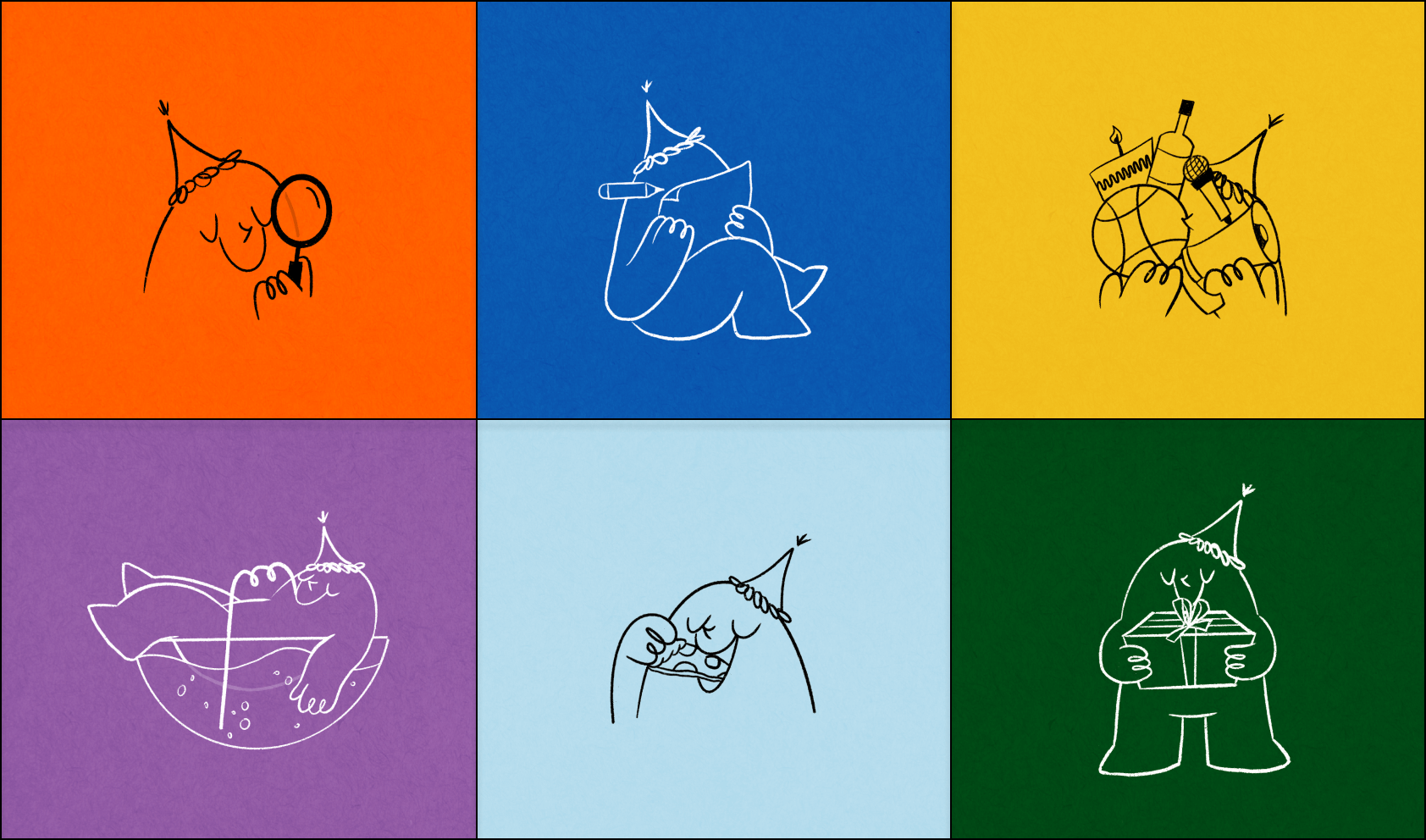
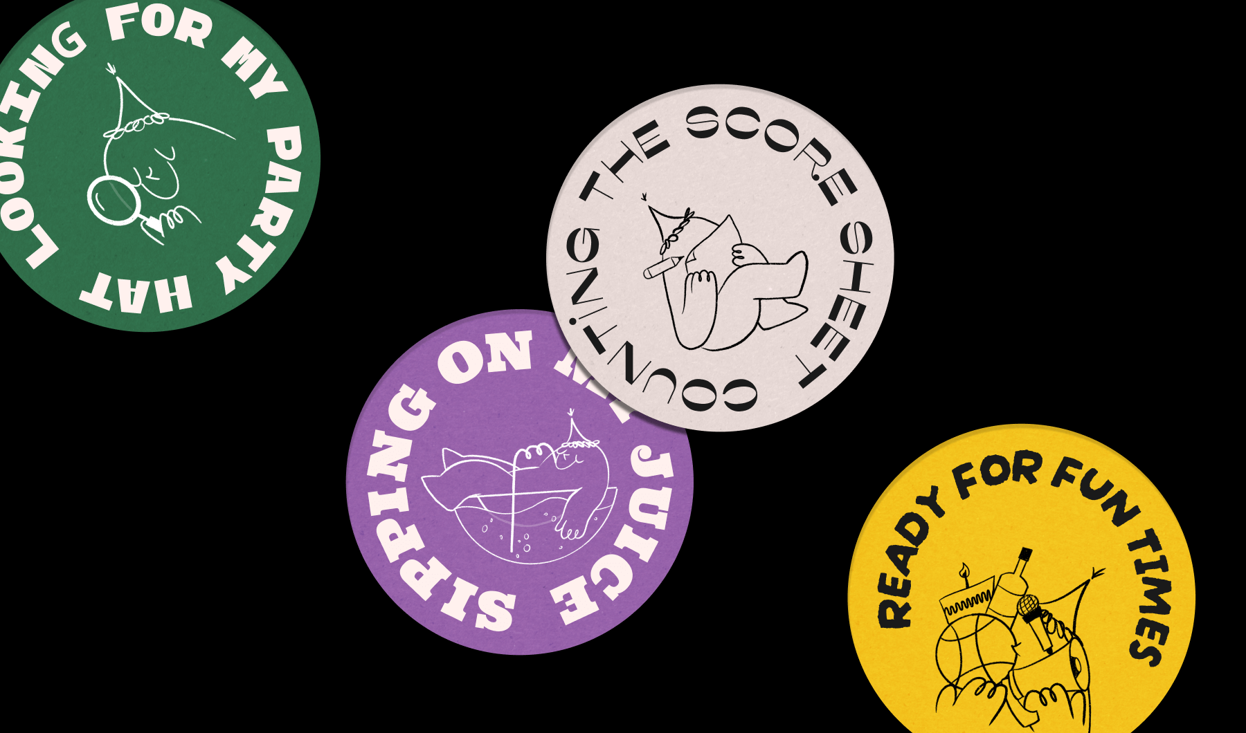
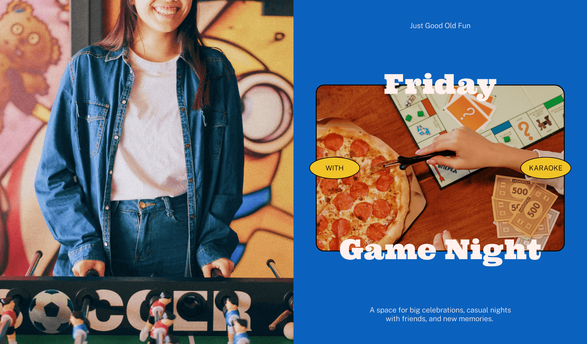
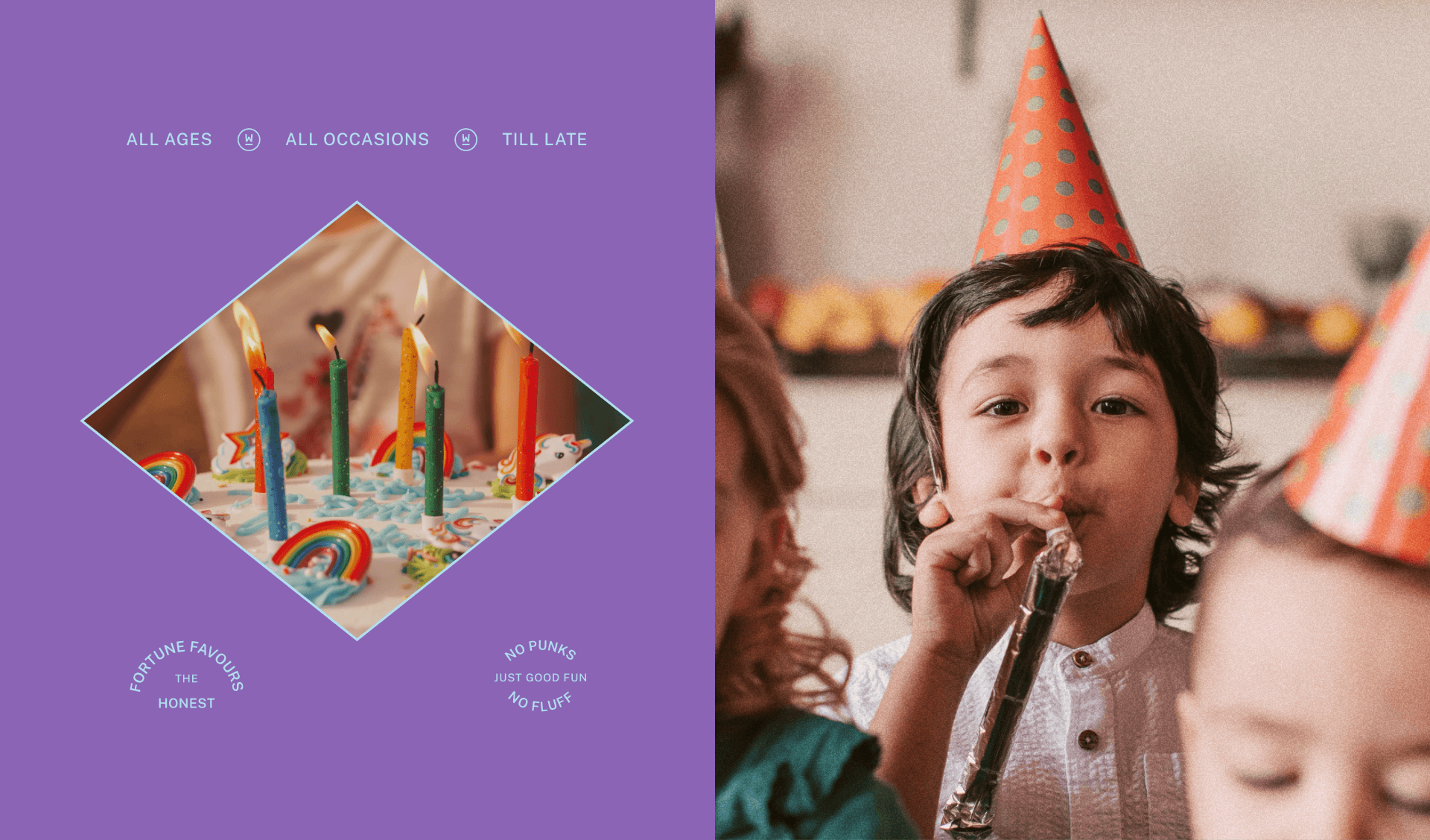
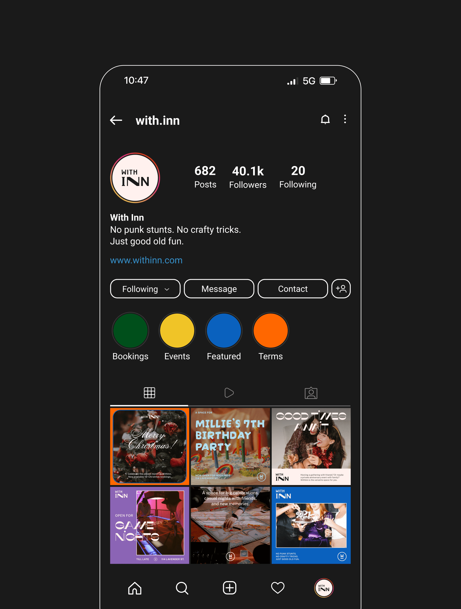
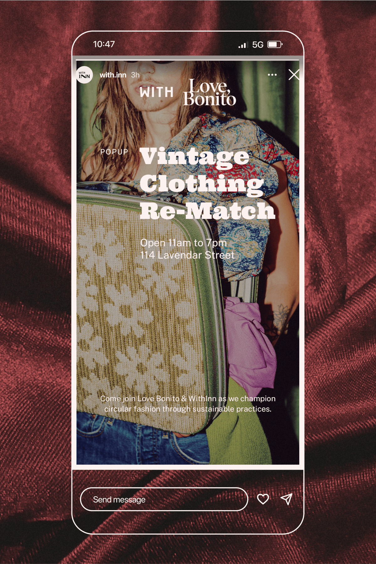
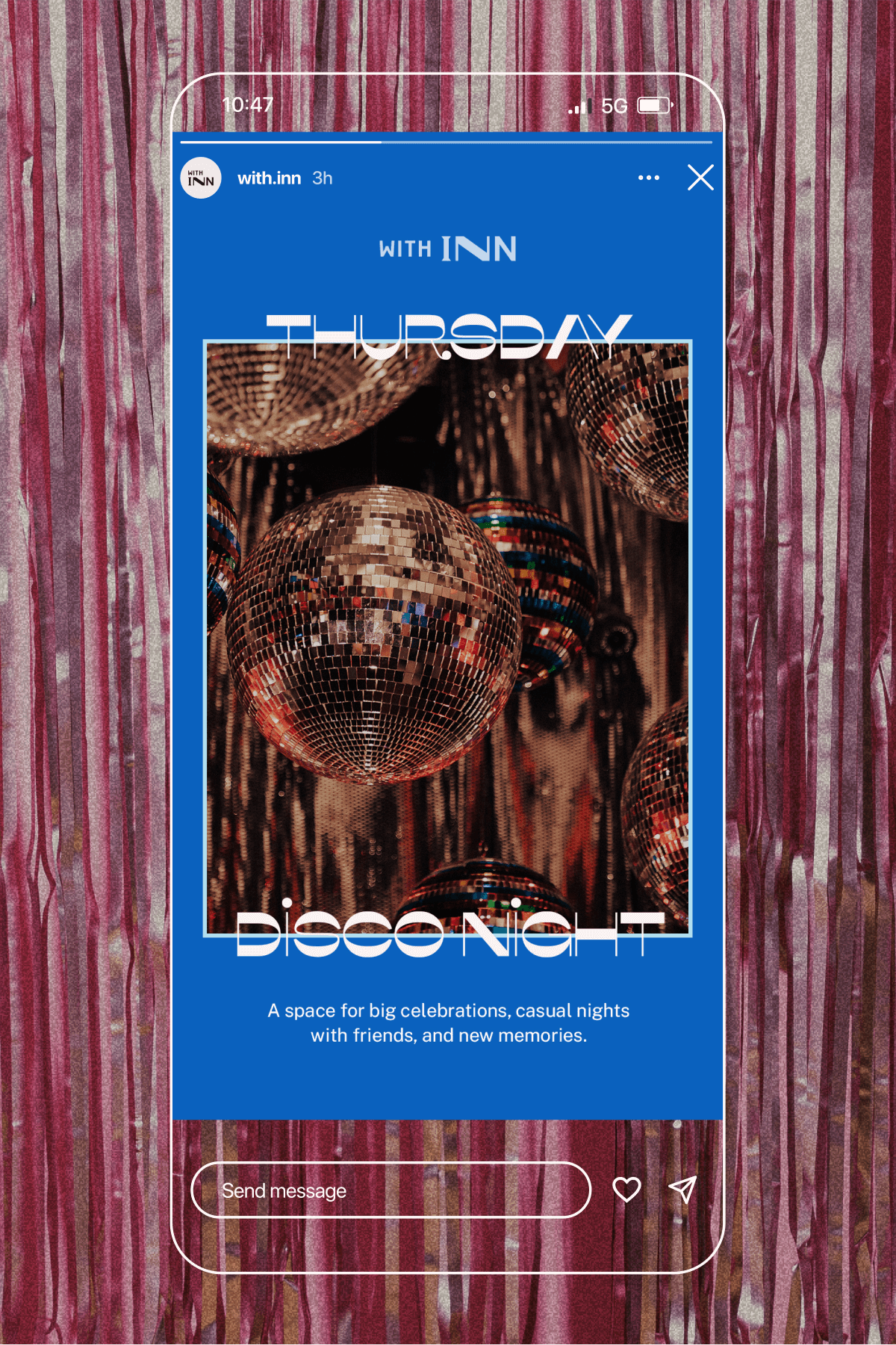
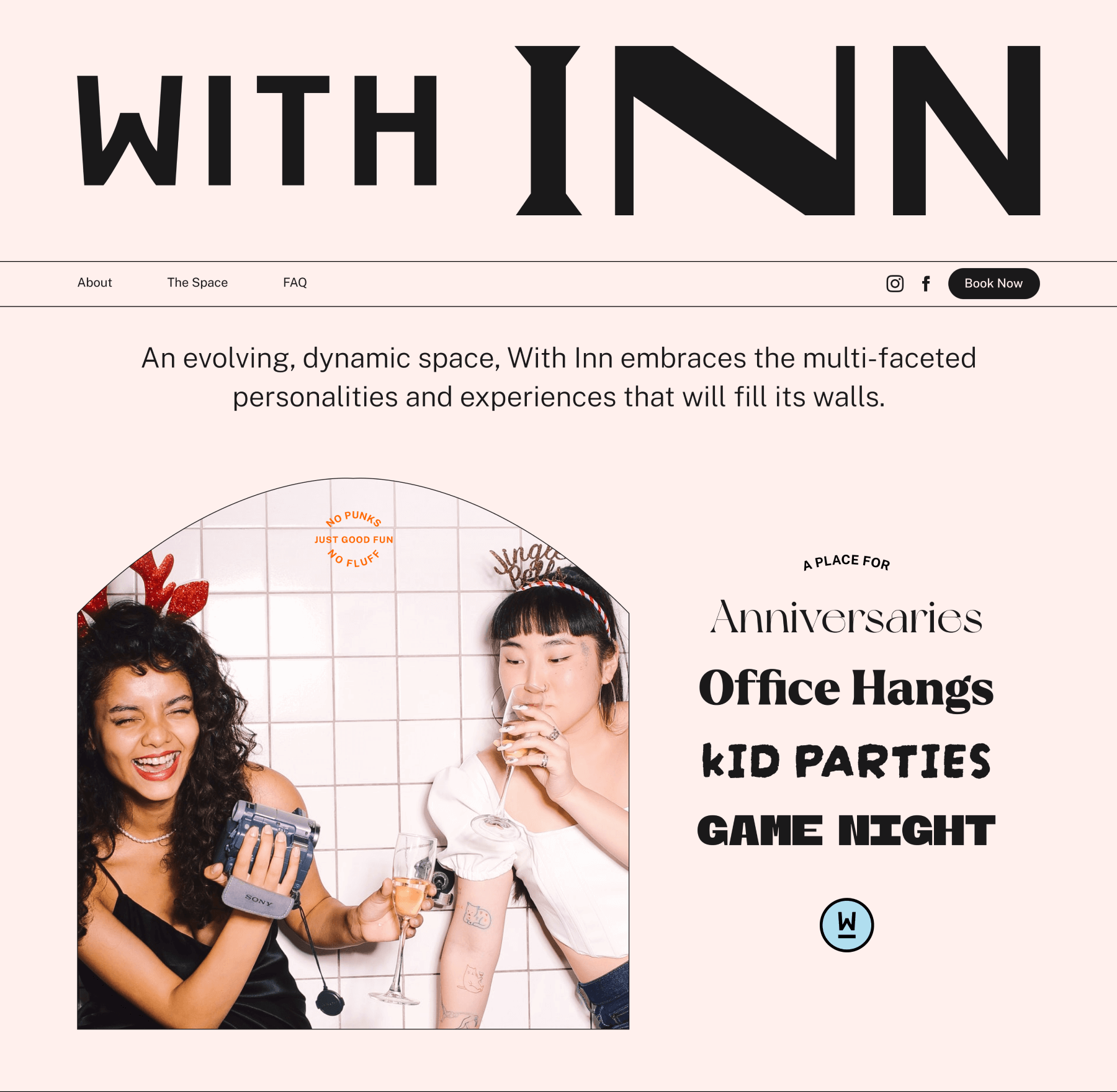
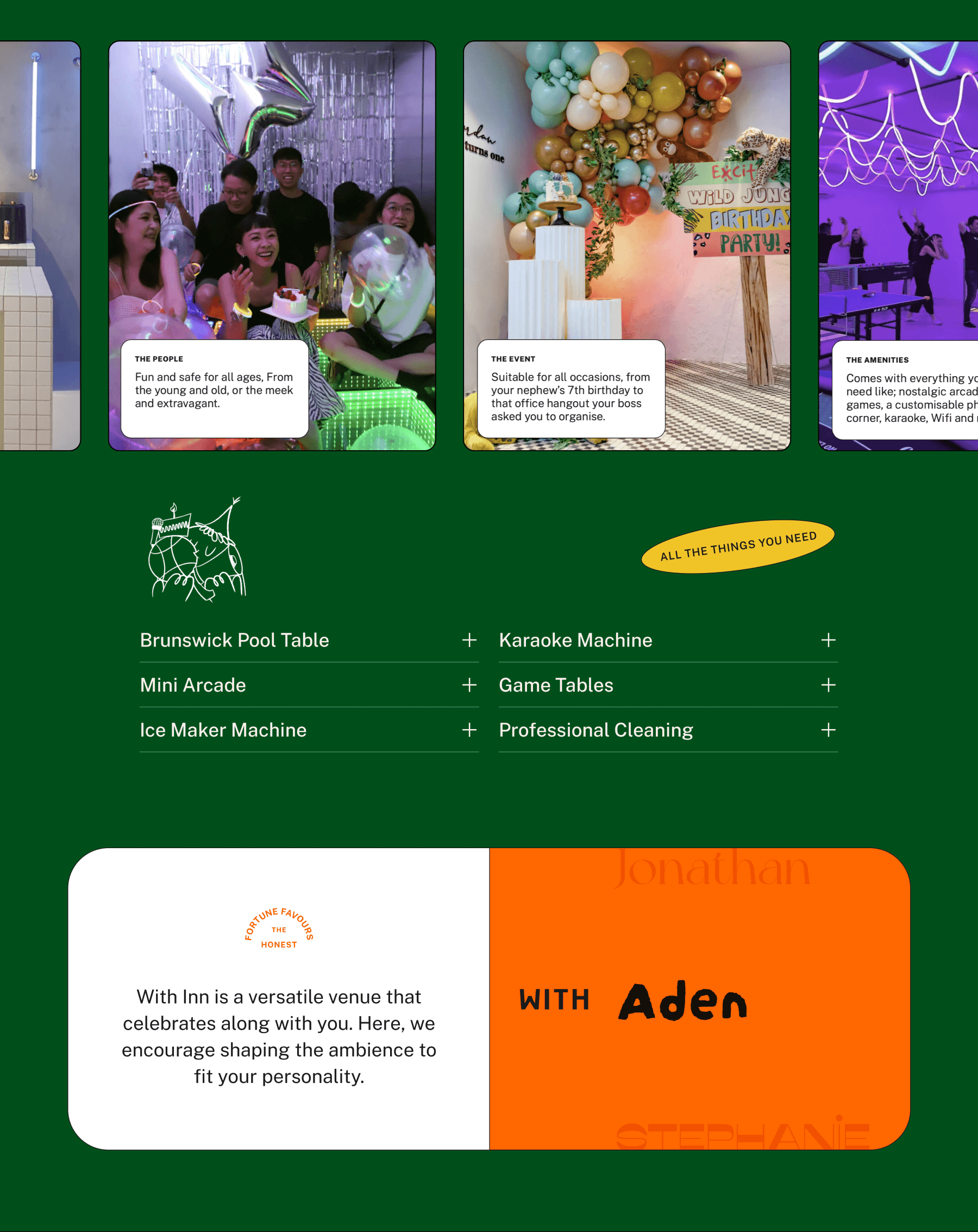
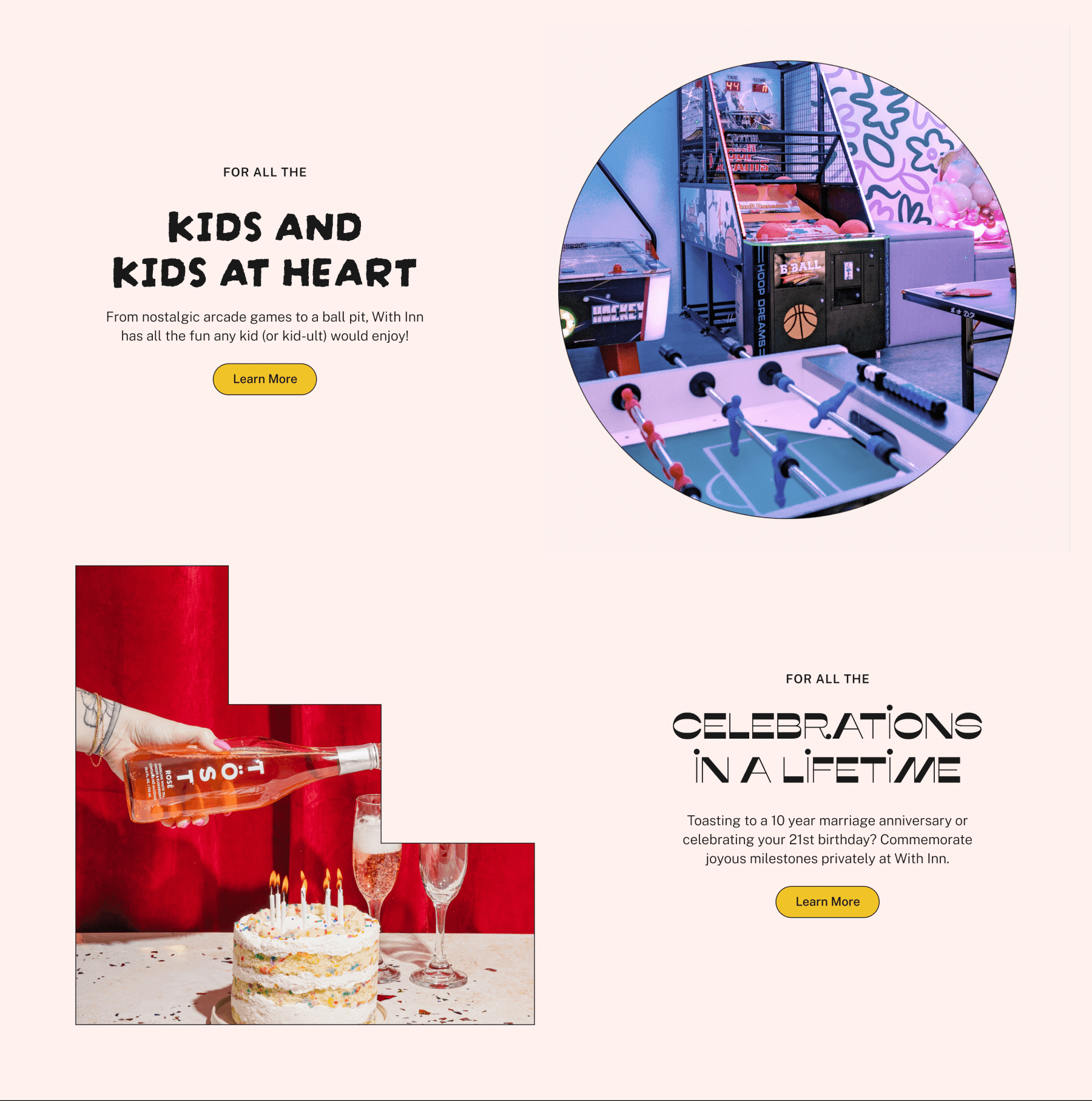
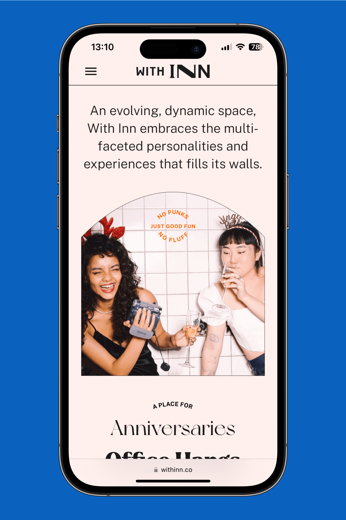
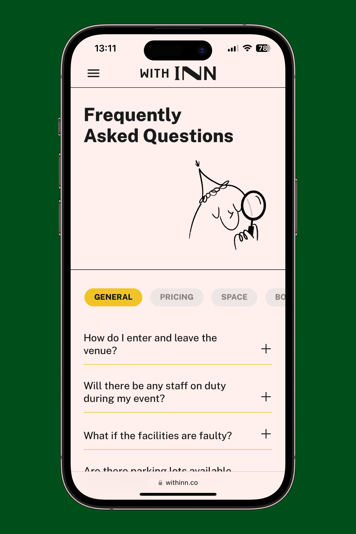
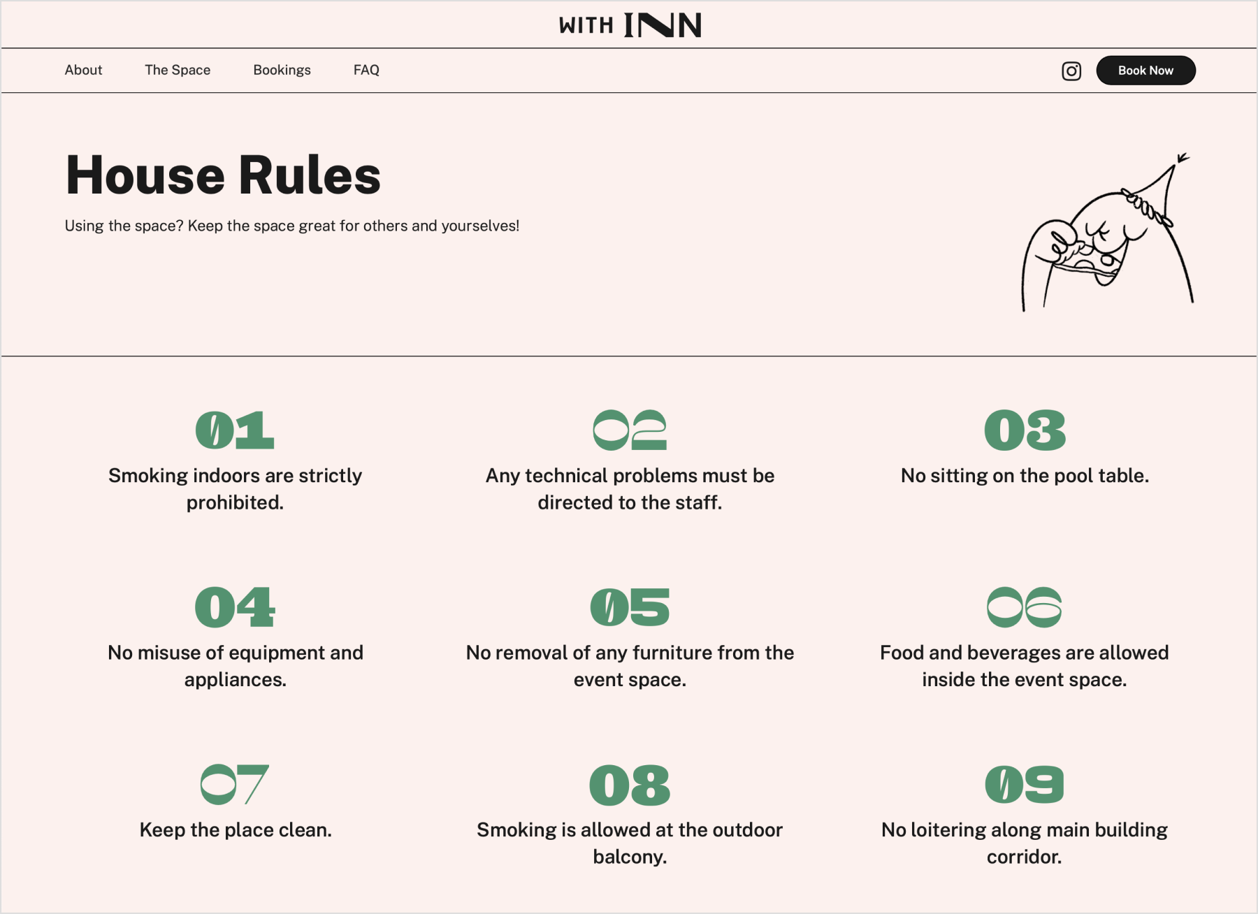
With Inn is an inclusive, dynamic event space created by The Local Innterior. For everyone & all occasions; from your annual New Year’s Eve countdown to your nephew’s jungle-themed 7th birthday. With Inn is a contemporary, versatile space that embraces & embodies the multi-faceted personalities & experiences that fill it. We did the whole shebang, from the identity & illustrations to a new website; launching a fresh new events space that was truly transformable for every occasion & person.

Withinn Wayfinding signage
Wayfinding signage
A dynamic space that holds space for all
With Inn’s versatile identity swaps with the occasion
BRAND POSITIONING

To stand out in the saturated industry of rental events spaces, we wanted With Inn to be a truly dynamic venue that was able to be both vibrant, contemporary and designed with it’s audience in mind.

With Inn was already named before we joined the project; ‘Inn’ originates from the parent company’s name. When combined, ‘With Inn’ is an apt version of saying ‘with The Local Innterior’ and ‘within’, which we thought was poetic — as all event venues hold space for the people using it but not all venues are brands that really focus on people. We played into the whole idea of not just events but people & memories ‘within’ the space, as a brand concept. We built the identity to morph with anyone and every event.

bRAND IDENTITY

To really cultivate the celebratory, versatile nature of With Inn, the identity is made up of a dynamic logo & typographical system with different faces, vivid colours, lively photography and a cheery illustrated mascot, all coming together to form a transformable identity that celebrates the different personalities and various functions within the space.

With Inn has 2 logo variations for its 2 main voices; the primary logo embodies the formal, generic voice and the secondary logo embodies the informal, quirky voice of the brand. Together with a range of display typefaces with various personalities, each touchpoint and visual of any event can be properly personalised for it’s host or purpose.

Withinn Logo Showcase
Initial variations of logo voices.
Initial variations of logo voices
With Inn’s versatile identity swaps with the occasion
Logo System

To fluidly express dynamism in a straightforward visual way, we explored different personalities & voices for our changing logos before settling on 2 official voices. The idea was to initially have 5-6 variations of ‘INN’ representing different personalities but that made it difficult for the internal team to implement. Our streamlined identity instead focuses on 2 main logo variations with the same style of lockups for both vertical & horizontal formats.

Our constant brand element in the identity is the non-changing ‘WITH’ that ties in all the transforming logo & type variations. In the logomark made for smaller scales, the simple ‘underlined’ W is used to not just represent & emphasise ‘WITH’ from the name but also acts as an acronym for ‘With Inn’ with the rotated ‘I’.

“With” can be used in a lockup for both brand collaborations & people
The With Inn brand experience pillars

‘WITH’ can not only be used in lockups for people such as ‘WITH Melissa’ or ‘WITH Aden’ ; they can also be used in lockups with other brand logos when a collaboration or partnership is involved, such as 
pop-ups or internal company events.

Withinn's typography system.
Withinn's typography system
Event place card
Withinn's Event place card.
Example type treatment for individual events
Welcome card sleeve
TYPOGRAPHY

With the wide range of display typefaces in the identity, the primary typeface for With Inn is Public Sans. An adaptable neutral typeface that can support all the fun, fancy display headlines but also look good in all sizes.

With Inn has a system of 8 typographical personalities used as display typefaces, each with different voices & functions. From engagement celebrations, 70s throwback karaoke to a kindergartener’s birthday, there’s a typeface for each occasion. These typefaces are used for names, headlines and headers.

Withinn Brand Colours.
Tri-fold promotional brochure.
Tri-fold promotional brochure
COLOURS

The brand has a mix of vibrant, fun colours and neutrals to support them, all inspired from the going-ons and moods of a playful event space.

Illustrations of With Inn’s mascot.
Example type treatment for individual events
Mock coastors for Withinn.
MASCOT

Inspired from different scenarios happening in a party, from juggling party supplies to searching for a missing phone - we illustrated a mascot for With Inn to support the identity especially in digital touchpoints. The mascot is used throughout the main website, socials and in brand merchandise.

Primary logo lockup with brand’s stair shape
Primary horizontal lockup with brand’s arch shape
Member cards
Withinn Member cards
Brand collaboration invites in an envelope.
Brand collaboration invites
Instagram profile with new brand identity
Withinn's Instagram Profile
Example of a Instagram story post in collaboration with an another brand.
Brand collaboration IG Story template
Generic Instagram story post.
Generic IG Story Template
Screens of Withinn's brand guide.
Brand guidelines
Exterior acrylic sign
Blue signage with Withinn logo.
Withinn Custom Keychain.
Green signage standee
Withinn Mugs
BRAND ELEMENTS

With Inn uses a mix of funky graphic shapes outlined in black to hold photography & colours. They can be tweaked to fit the ratio of different formats and embellished with other shapes in a single layout for full flexibility. The main brand elements are the arch, stairs, rounded rectangle and diamond.

A secondary brand element used in the identity is With Inn’s tertiary logomark, which can be used as bullets to separate captions or as a graphic embellishment with or without a colour fill.

WEBSITE

The With Inn website was designed to embody a friendly, casual vibe that still looked professional and communicated the crux of the brand’s ethos to its target audience, all the amenities included in the space, booking instructions and basic house rules.

The site was also built on Webflow for easier site management and web editing even after we hand over the project to the client. You can visit the full website here.

Homepage
Mobile Homepage
Mobile FAQ Page
About Page
The Space Page
House Rules
Next Project
Thins featured image
Sleep Thins
BRAND
PACKAGING
PRINT
WEBSITE