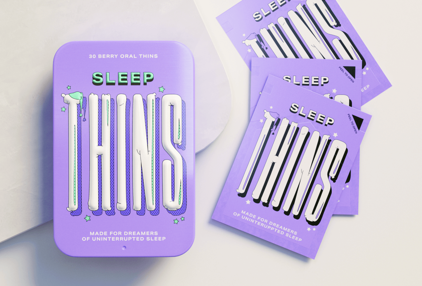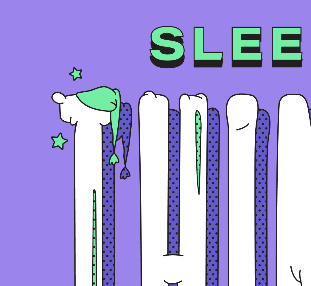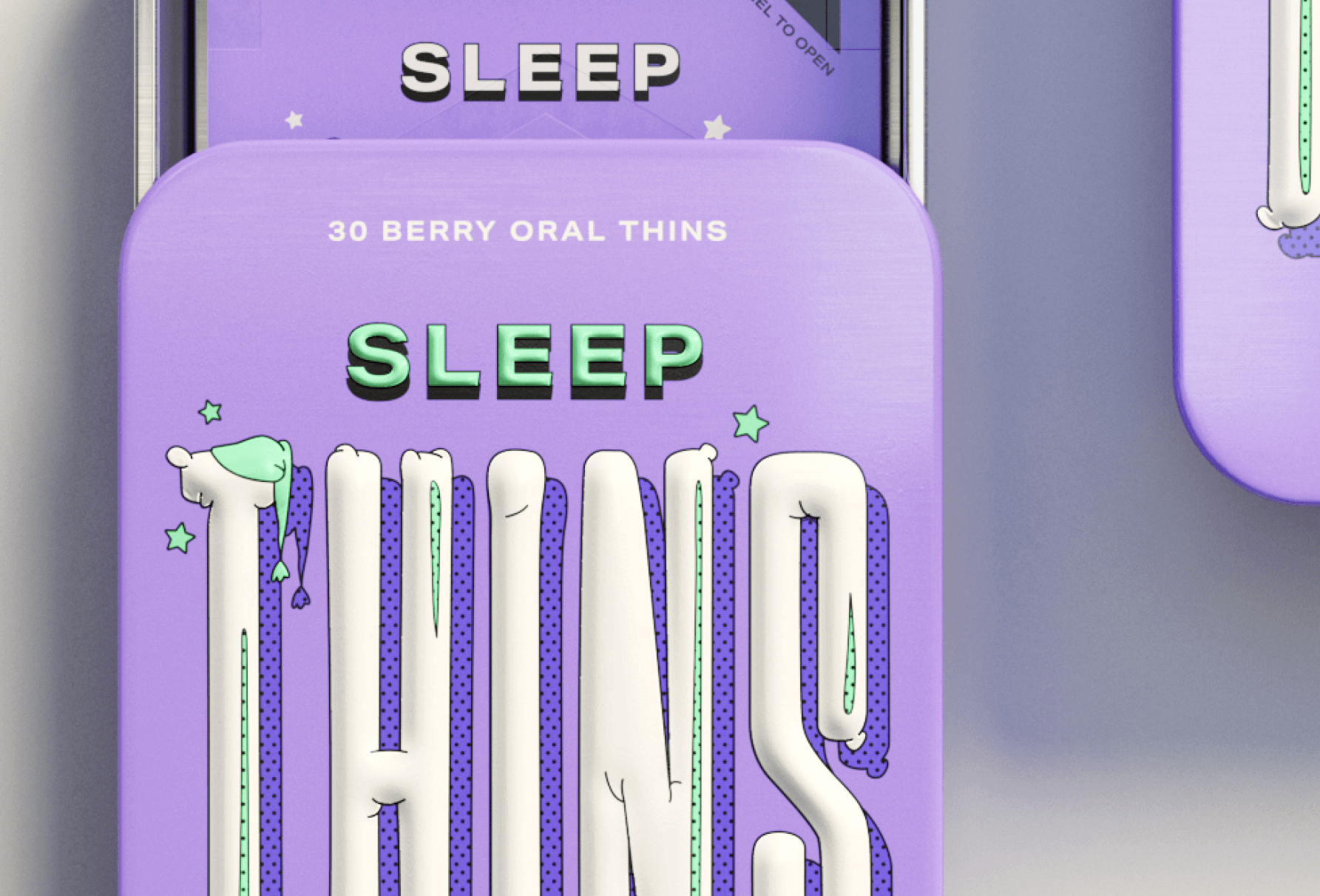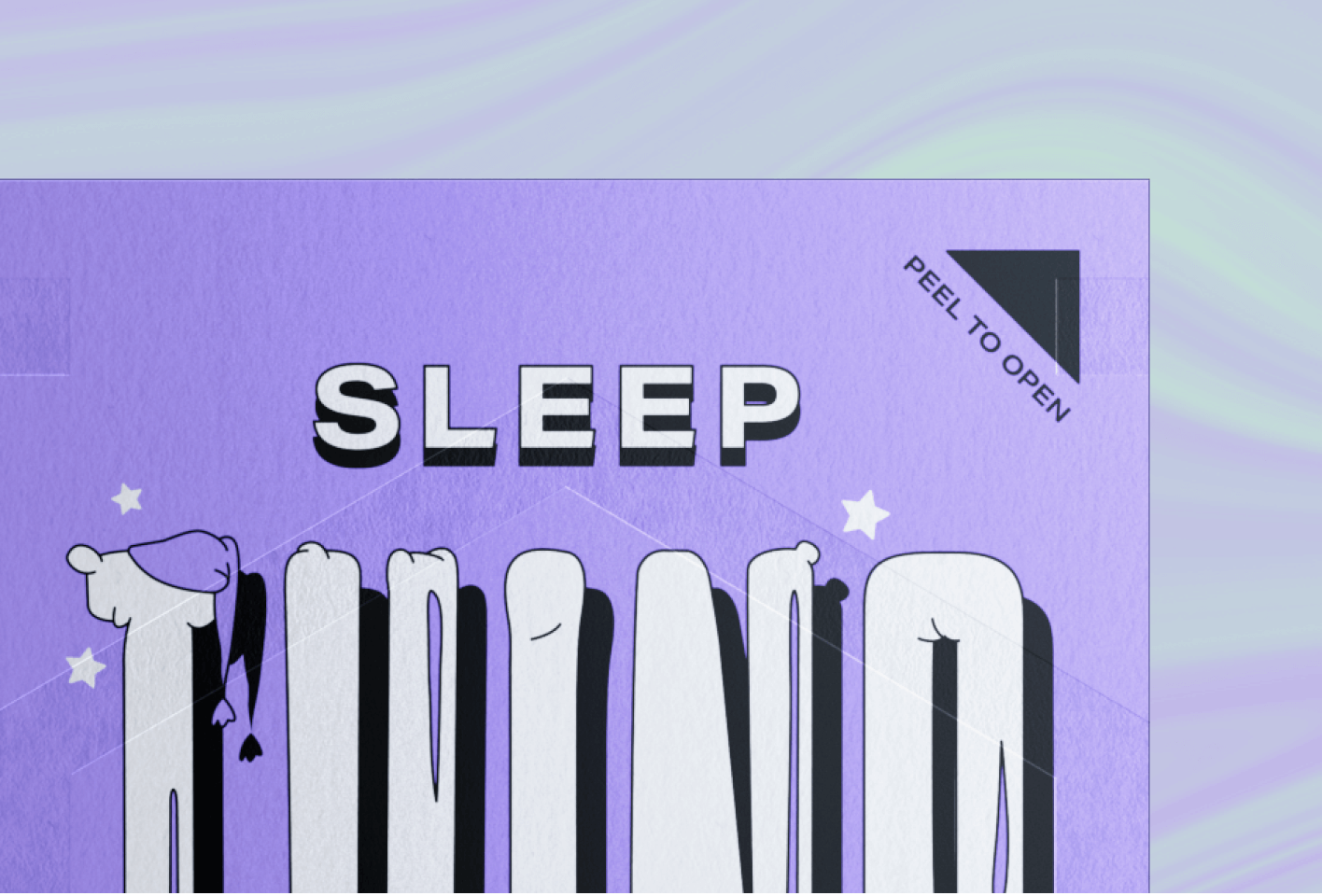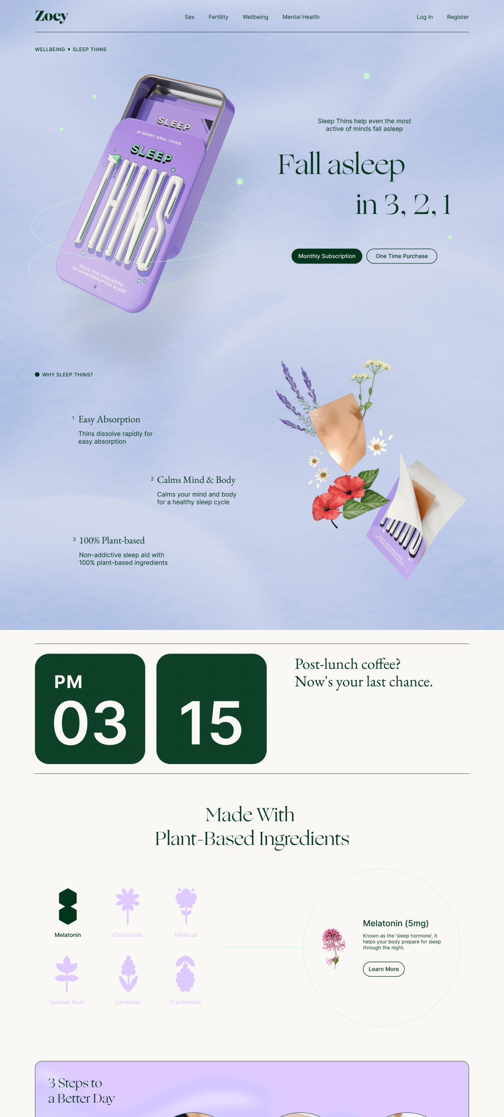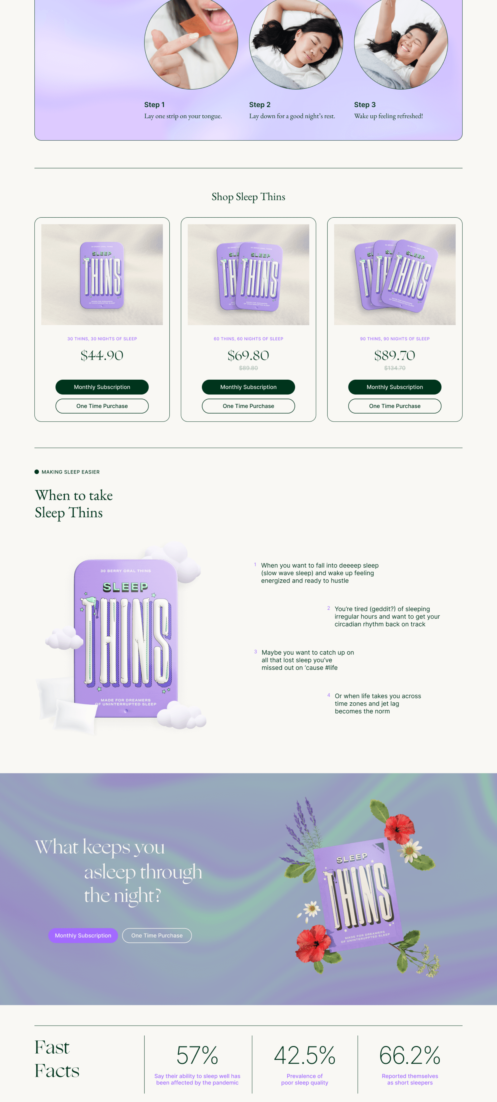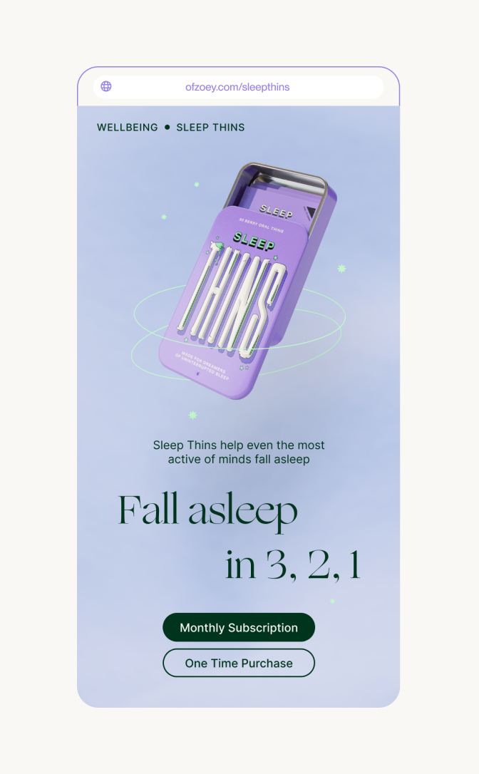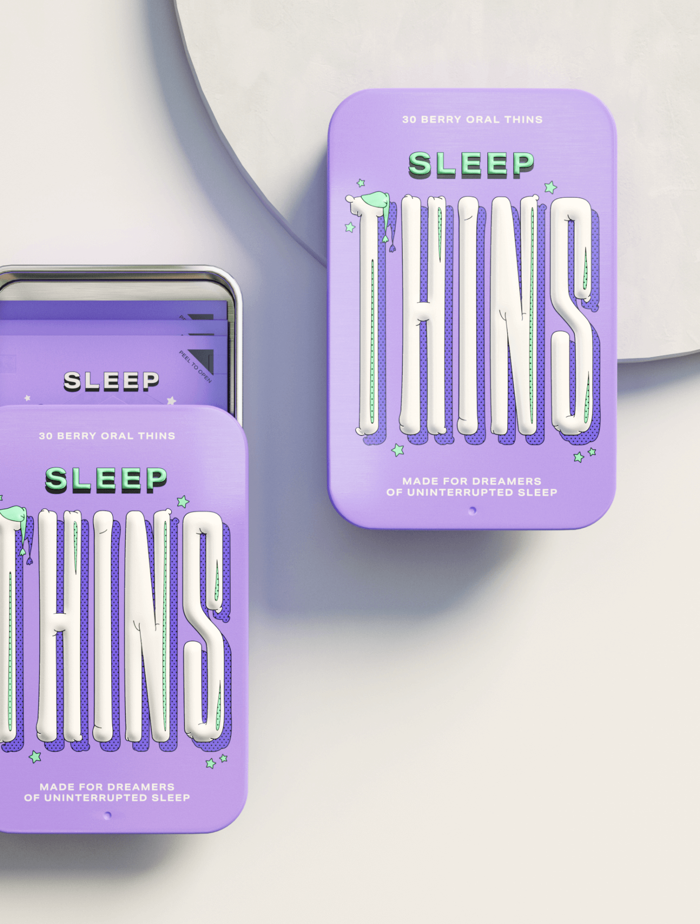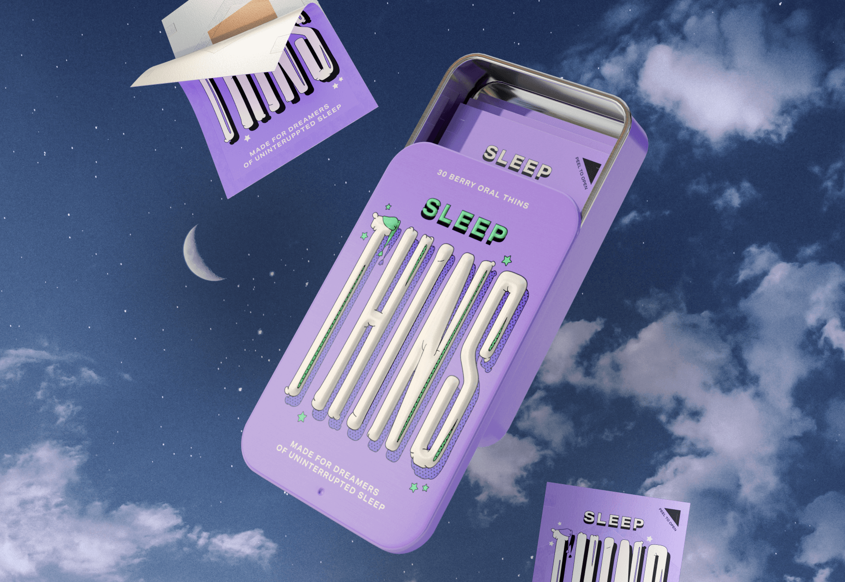
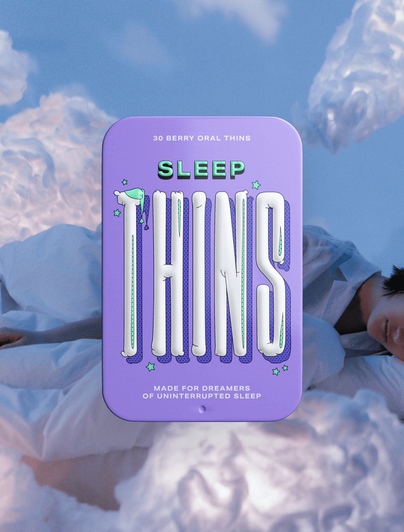

Sleep Thins’ front packaging design
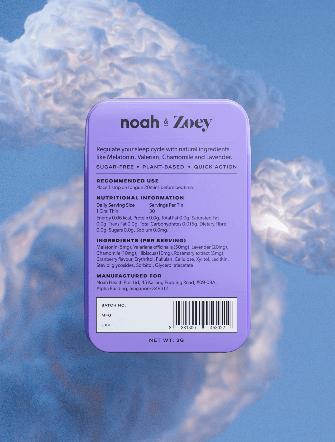
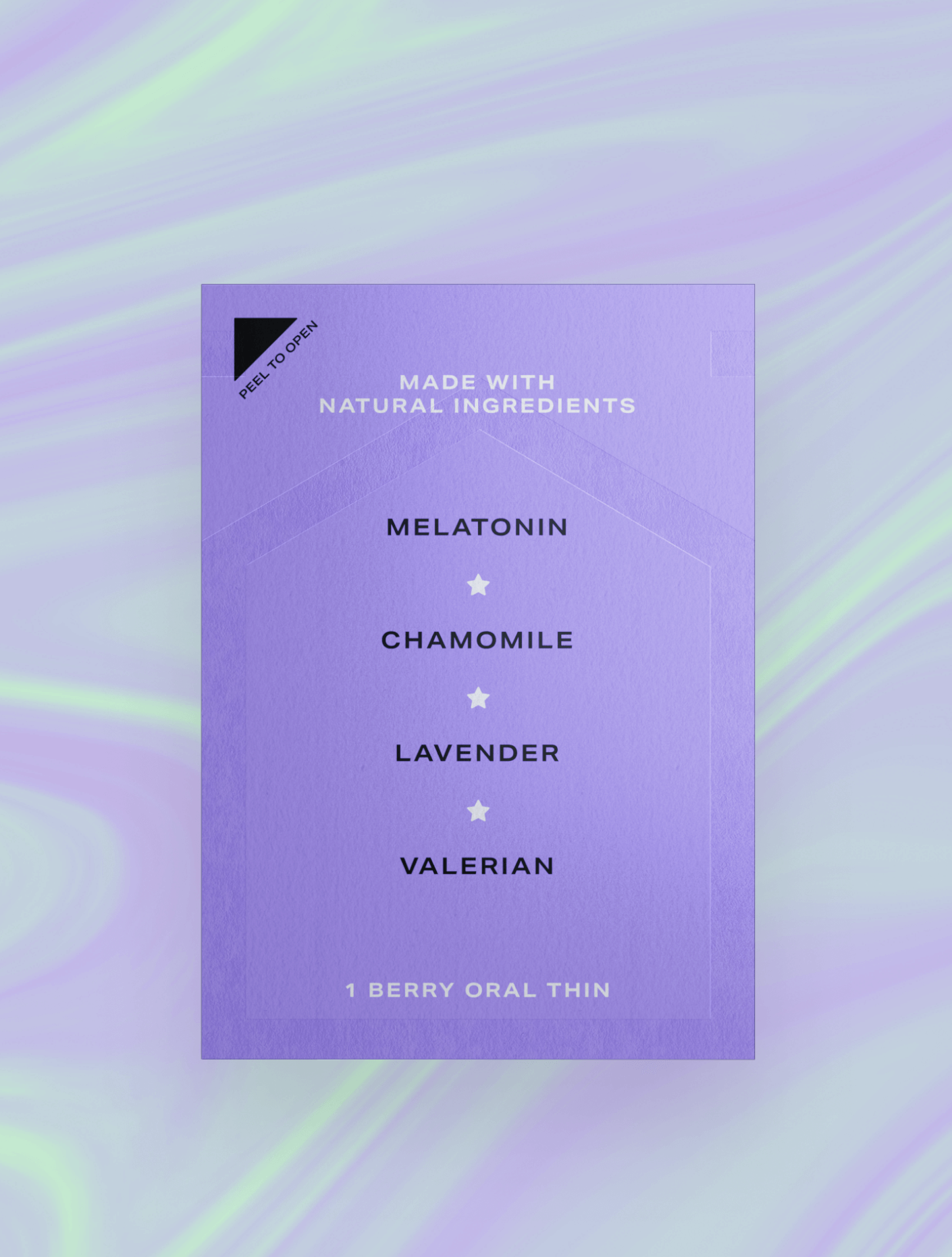
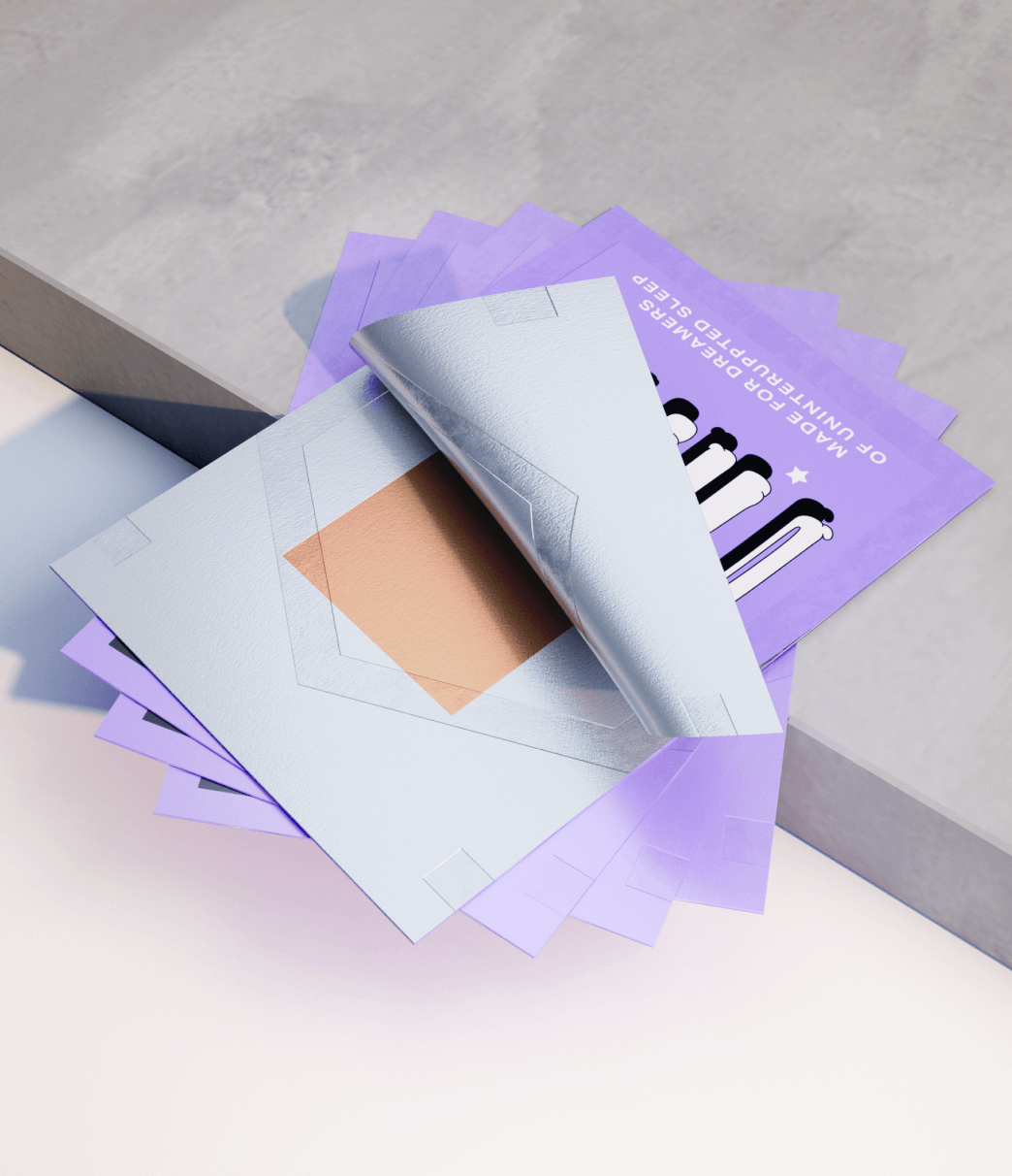
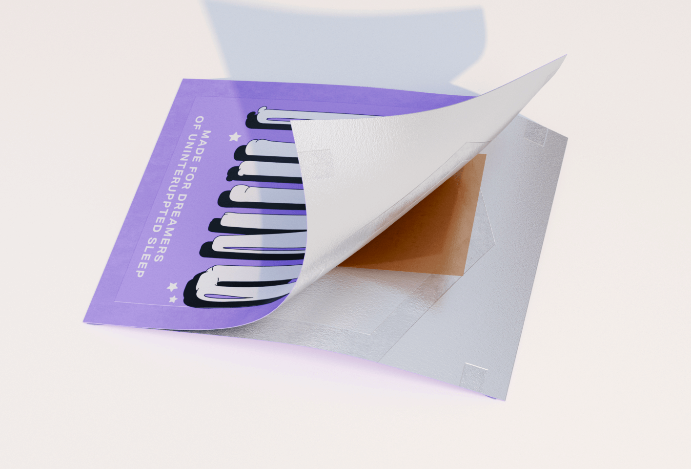
Sleep Thins’ back packaging design
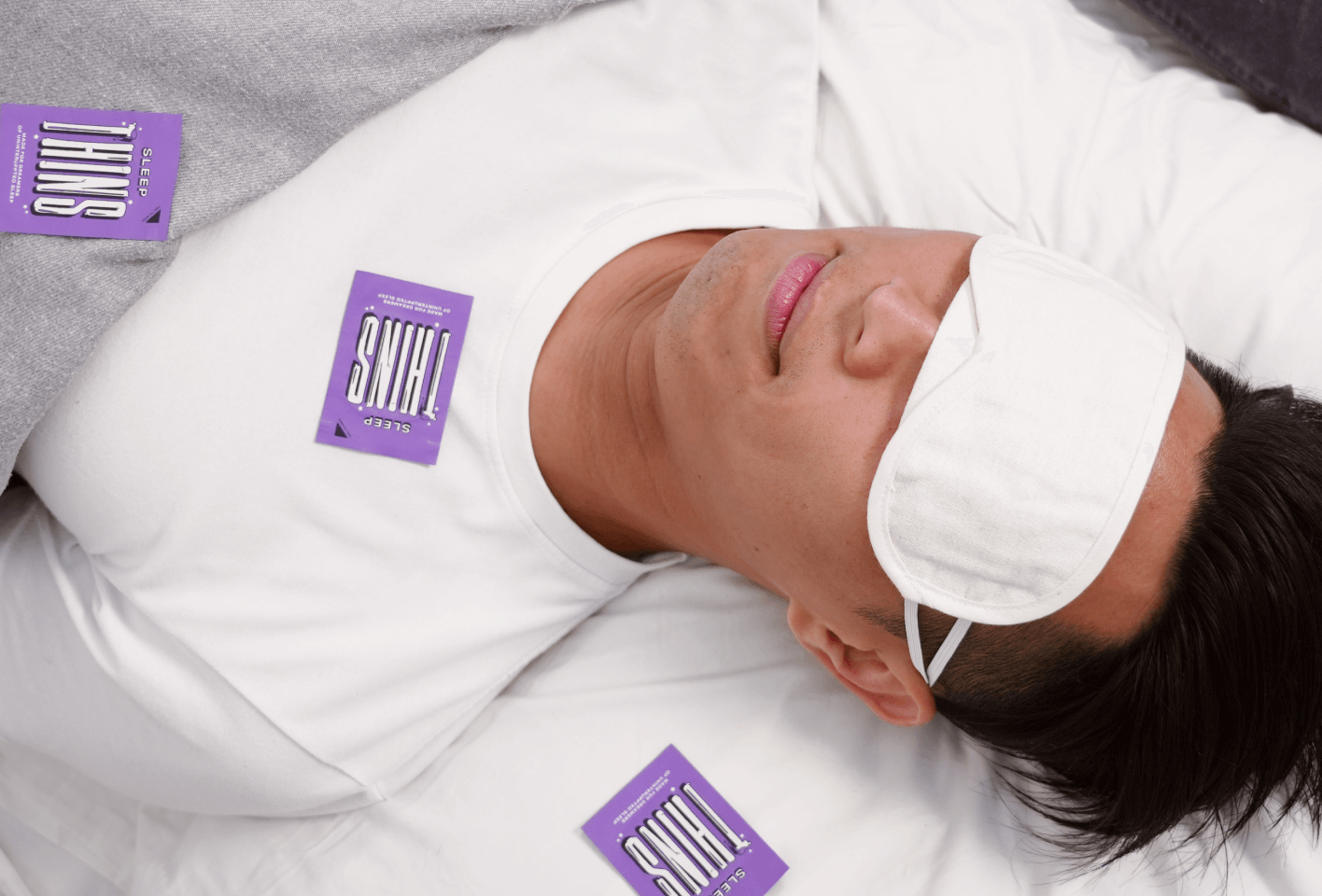
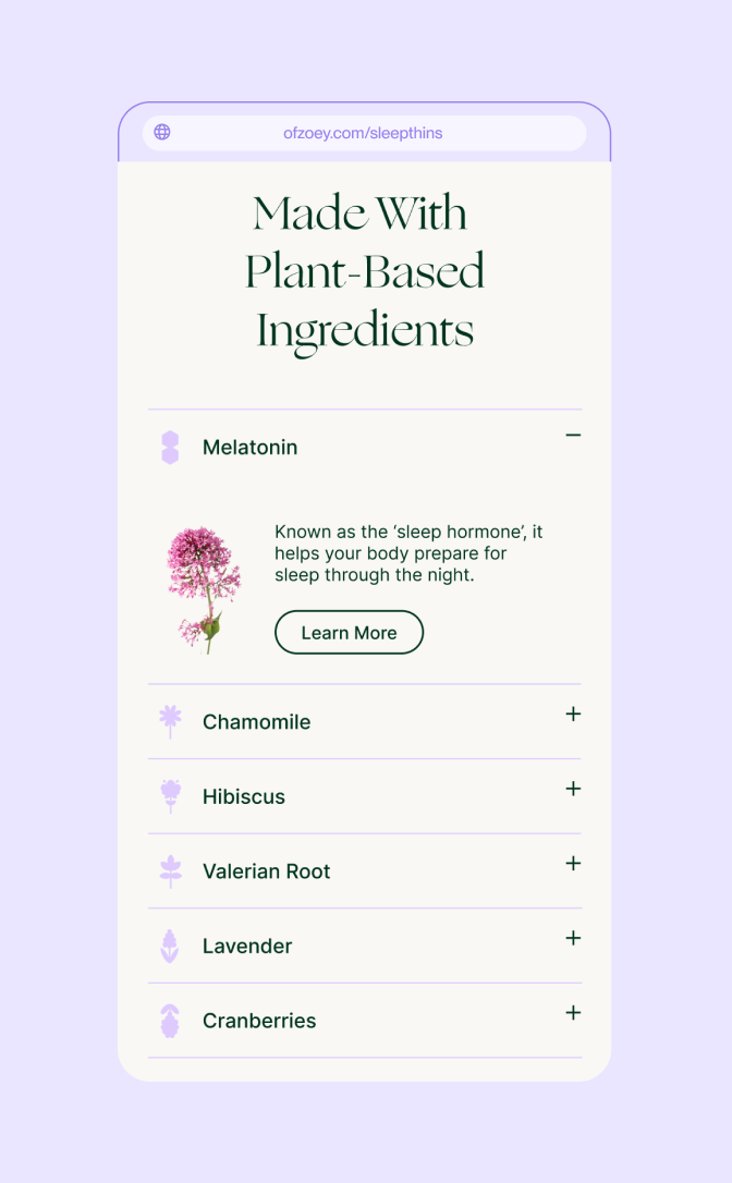
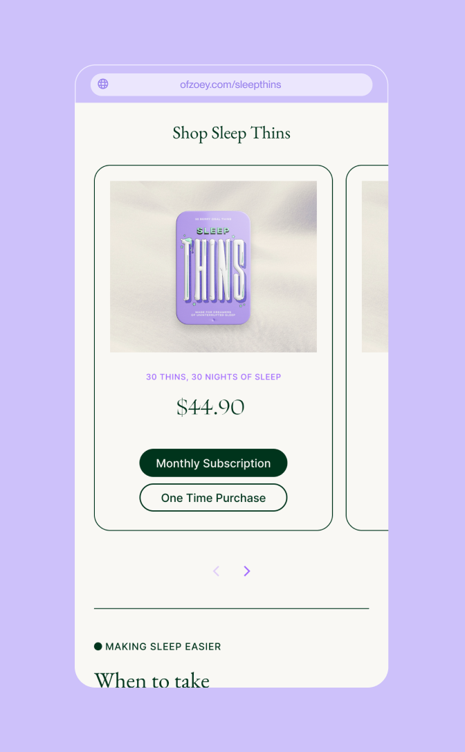
Sleep Thins
2021
BRAND
packaging
print
WEBSITE
Client
Noah & Zoey (Ordinary Folk)
Agency
In-House
Role
Lead Designer & Art Director
Industry
Healthcare, Lifestyle, Retail
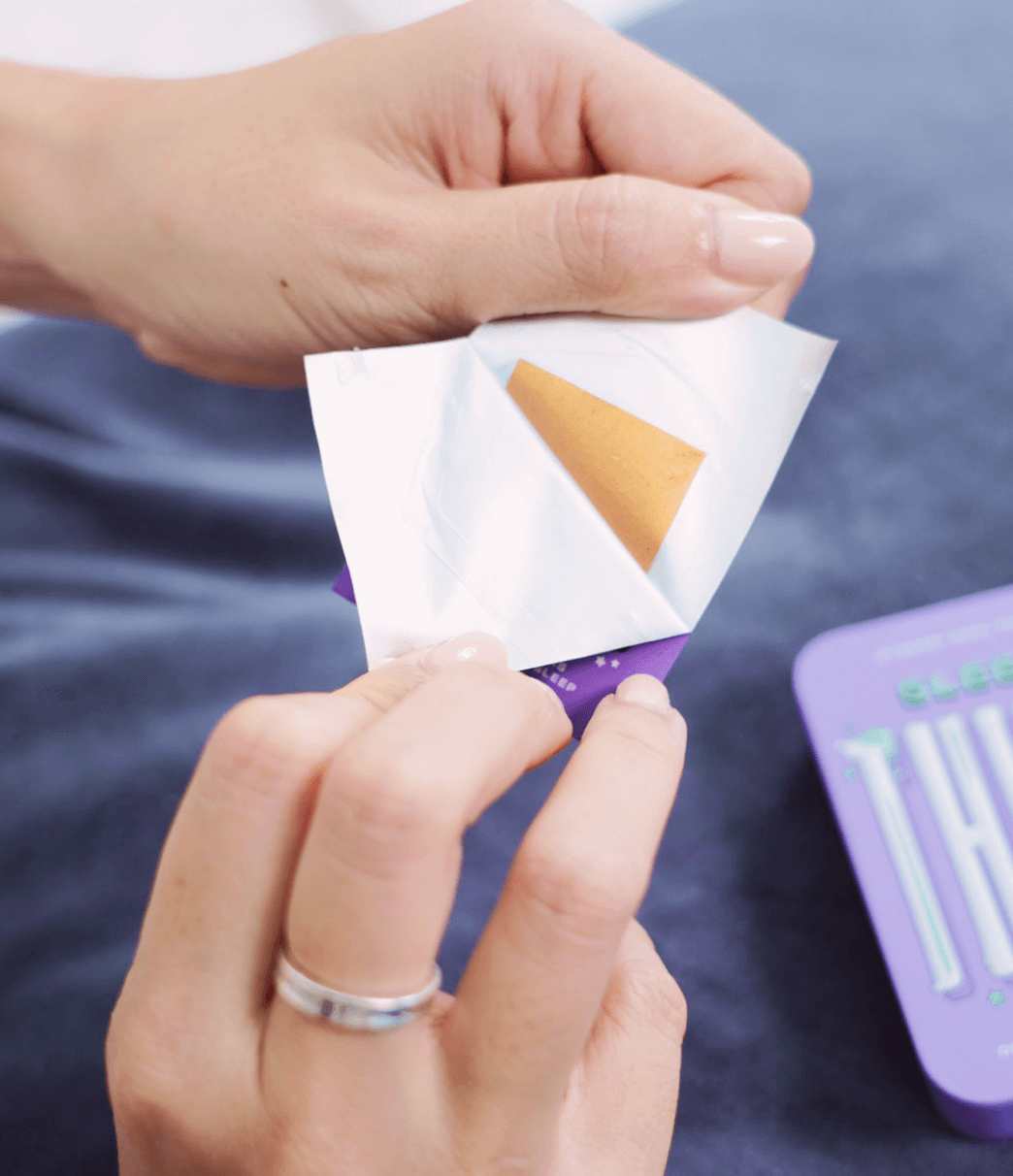
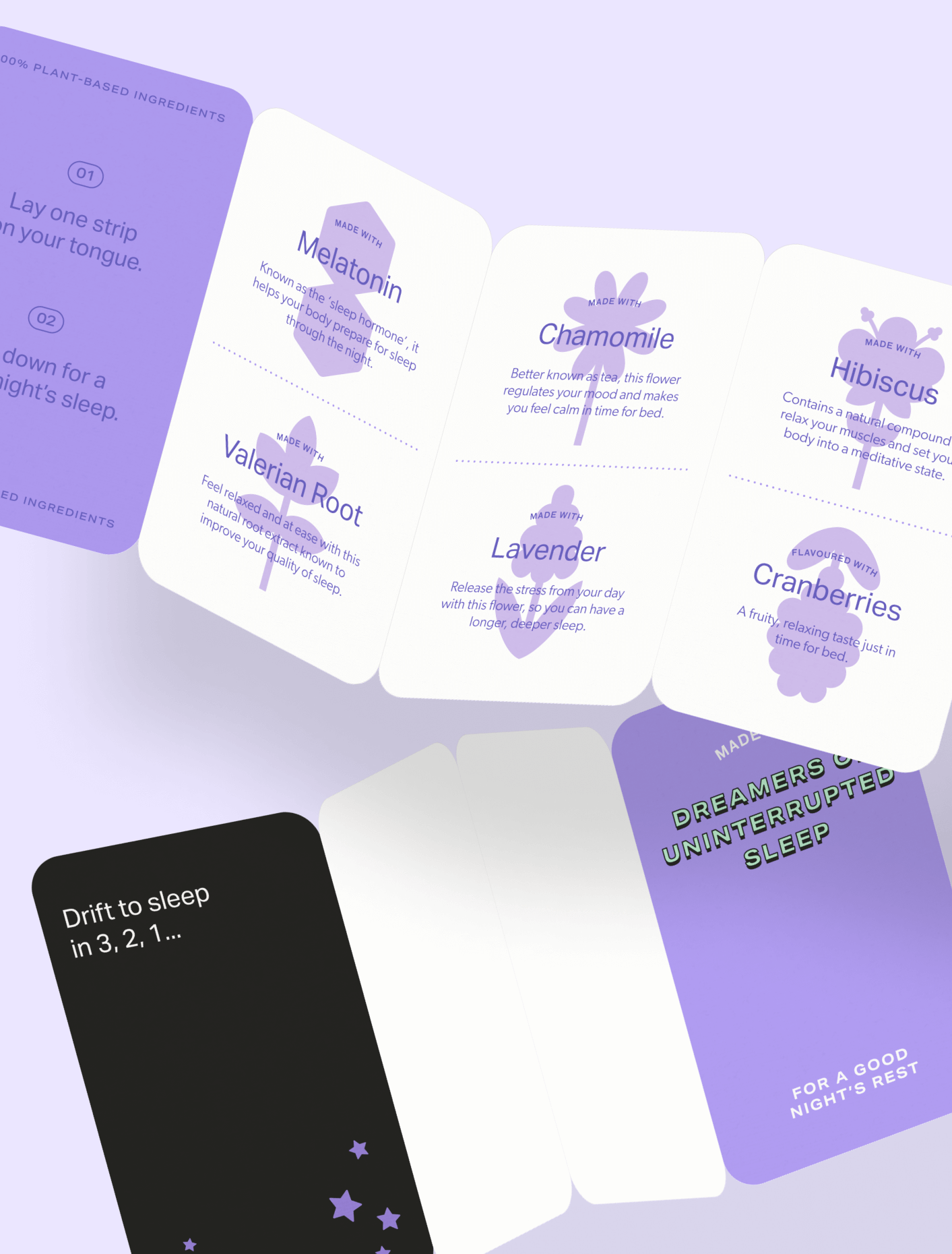
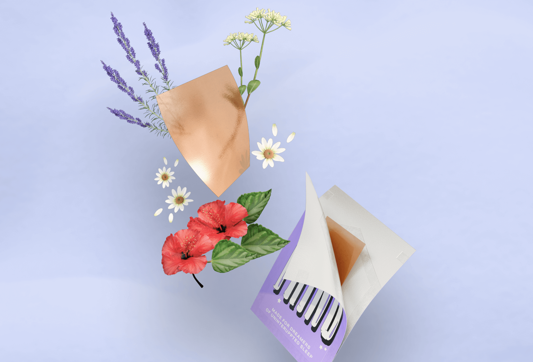
Sleep Thins is Singapore’s first sleep supplement in oral thin format made by Noah & Zoey as an over-the-counter product — I designed every element, from the custom type, art direction & packaging to the individual web pages. To emphasize the dreamy & slumberous qualities of Sleep Thins, the art direction took cues from all things sleepy & comfy; from soft pillows to psychedelic dreamscapes.